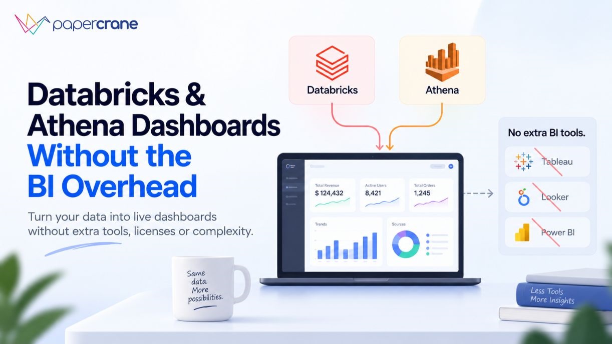
You’ve already done the hard part. The data is ingested. The pipelines are running. Your Databricks lakehouse is humming, or your Athena queries are firing against S3 on demand.
And then someone in a meeting asks for a dashboard, and suddenly you’re being quoted $75 per user per month for Tableau, or spending a Friday afternoon debugging QuickSight embed configs.
This is the BI overhead trap. And for lean data teams, it’s the part of the stack that quietly eats your budget and your time.
Why Databricks and Athena Users Keep Adding BI Tools They Didn’t Want
Databricks is a lakehouse and processing platform. AWS Athena is a serverless SQL query engine that runs directly over S3 data. Neither was designed to be a business intelligence layer, and that gap creates a recurring problem.
Databricks did launch AI/BI (formerly Lakeview Dashboards) in 2024, and it’s evolved quickly. The platform now lets teams unlock and share insights from their data without the need for a separate BI system. But there’s a catch: Databricks AI/BI only works with data governed under Unity Catalog, inside Databricks itself.
If your data lives elsewhere or if your stakeholders need a polished, standalone dashboard experience, you’re back to bolting on another tool.
Athena has it worse. It’s a query engine, full stop. There is no native visualization layer. The standard path is Athena → QuickSight, but that introduces Author licenses, SPICE dataset refresh delays, and a UI that many non-AWS users find alienating. The alternative is Athena → Tableau or Power BI via ODBC connector, reintroduces the per-seat licensing overhead you were trying to avoid.
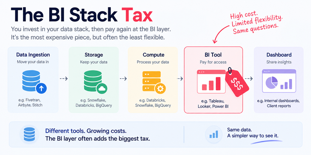
The result is predictable: a working Databricks analytics setup often requires five tools and five contracts before a single dashboard appears. Databricks or Athena for compute, Fivetran or Airbyte for ingestion, dbt for transformation, a BI tool for visualization, and an orchestration layer to hold it together. That’s five vendors, five renewal conversations, and five support queues.
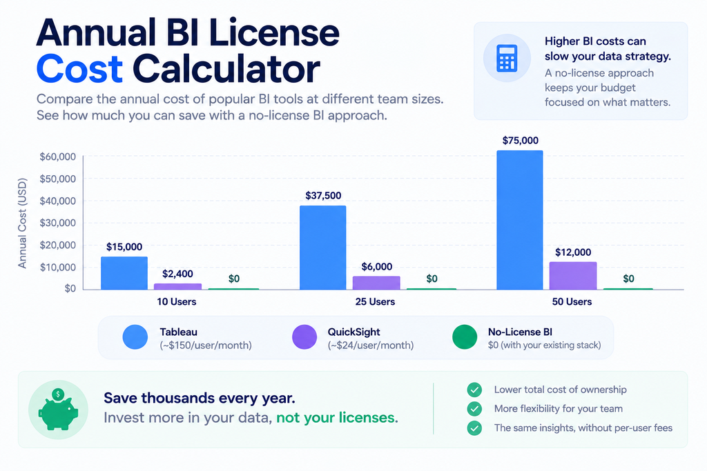
What “Just Add Tableau” Actually Costs a 20-Person Team
The math on BI licensing is rarely laid out plainly, so here it is.
The Creator licence for Tableau Standard runs around $75 per user per month, which covers Desktop, Prep, and Server access. Explorer licences for analysts who build on existing data sources come in at around $42 per month. Viewer licences for stakeholders who only need to consume dashboards are $15 per month each. A 10-person team with a mix of creators and viewers can easily land at $7,000–$9,000 per year before factoring in Tableau Server infrastructure.
QuickSight looks cheaper at first glance, an Author licence starts at $18/month but the per-session reader model ($0.30 per session, capped at $5/month per user) adds up unpredictably as dashboard usage scales. And it comes with its own overhead: no version control, dashboards that auto-save by default, limited customization for complex visual layouts, and API automation that turns frustrating fast.
Beyond the licence fees, there are the invisible costs: onboarding time, semantic layer duplication (defining the same metrics in both your data warehouse and your BI tool), connector maintenance as schemas evolve, and the engineering hours spent administering a platform that isn’t core to your product.
According to Databricks’ engineering data, poorly optimized BI queries account for up to 35% of wasted SQL Warehouse compute in enterprise deployments, meaning the BI layer is actively working against the efficiency of your compute layer.
The question isn’t whether BI tools have value. They do. The question is whether your team actually needs one to get dashboards in front of stakeholders.
What Databricks SQL Dashboards Can (and Can’t) Do Natively
Before looking at alternatives, it’s worth understanding where Databricks AI/BI Dashboards genuinely shine, and where the edges are.
On the strong side: Databricks SQL Dashboards (built on the AI/BI layer) now support multi-page reporting, calculated measures, global filters, AI-assisted authoring, and scheduled email subscriptions for PDF snapshots.
Performance has improved dramatically, dashboards that previously took 10 seconds to load now render in around 2 seconds with DBSQL Serverless, without requiring any manual index tuning or configuration. For databricks visualization inside the platform, this is a meaningful native option.
The limitations are real, though. AI/BI Dashboards only work with data registered in Unity Catalog. Cross-dataset filtering across multiple data sources is a known friction point that the community has flagged repeatedly.
Map visuals remain limited. And if your business users need to take action from inside the dashboard, updating a forecast, assigning a flag, routing an approval the platform doesn’t support write-back.
Most importantly for this article: if your data lives in S3 and you query it through Athena, Databricks’ native dashboard layer doesn’t help you at all. You need a different path.
Ready to skip the setup friction? You can connect your Databricks workspace to a dashboard without configuring a separate BI tool.
Why Building an Athena Dashboard Feels Harder Than It Should
Amazon Athena is genuinely excellent for what it does. It’s serverless, it runs standard SQL directly over S3 data in formats like Parquet and CSV, and you only pay for the queries you run.
There’s no infrastructure to manage, no clusters to size, and no minimum commitments. For ad hoc analysis and exploratory queries, it’s hard to beat.
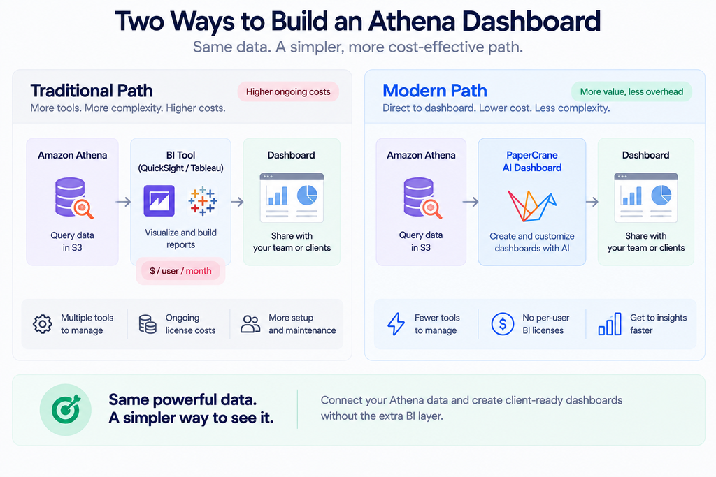
But Athena is a query engine, not a dashboard platform. The moment a stakeholder asks to see a chart updated daily, you need something else. The standard AWS answer is QuickSight, and for teams already deep in the AWS ecosystem with dedicated BI authors, that can work.
But QuickSight has documented pain points: no version control for dashboards, limited support for complex geospatial data, clunky promotion between environments (dev → staging → prod), and self-service analytics that require Creator licences to function, which aren’t cheap.
The alternative connector path, using Tableau or Power BI via the Athena ODBC driver or the official Power BI connector, reintroduces the full weight of enterprise BI licensing. Teams that previously needed only Athena (pay-per-query, no ongoing costs) suddenly find themselves committed to an $18–$75/user/month BI subscription with its own maintenance surface.
The pattern teams keep rediscovering: Athena makes the data cheap and fast to query. The visualization layer makes it expensive and slow to ship.
You can connect AWS Athena directly to a dashboard and skip the BI middleware entirely.
What a Modern Databricks & Athena Dashboard Setup Actually Looks Like
The good news is that the category has moved. There’s now a class of AI-native dashboard builders designed specifically for teams that already have a strong data layer, and don’t want to add another BI contract on top of it.
The key difference from traditional BI tools is the connection model. Instead of importing data into a proprietary engine (like QuickSight’s SPICE) or requiring a desktop client to connect (like Tableau Desktop), AI-native dashboard builders connect directly to your Databricks SQL endpoint or your Athena query engine as a live data source.
Queries run against your actual data at query time. There’s no duplication, no refresh schedule to manage, and no semantic layer to maintain in parallel.
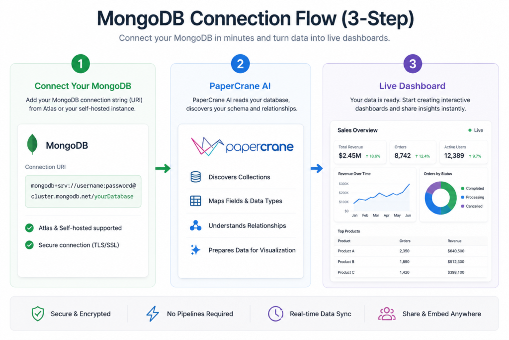
For a databricks sql dashboard built this way, the workflow looks like this: connect to your SQL warehouse endpoint, point at the tables or views you care about, describe the chart or metric you want in plain language, and share the result via a link. No Tableau Server to configure. No QuickSight SPICE datasets to refresh. No separate admin panel for user permissions.
For Athena, the same principle applies, a direct connection to your Athena endpoint means your S3 data is queryable in seconds, and the dashboard reflects live query results rather than a stale import.
If your team is already building dashboards without writing SQL by hand, this extends naturally. You can read how teams are doing this with the Papercrane AI dashboard builder without SQL approach. And if you’ve seen how quickly this works on other cloud warehouses, the Snowflake dashboard in minutes pattern translates directly.
You Don’t Have to Throw Out Tableau
A fair caveat before the checklist: Tableau and Power BI aren’t bad tools. For large enterprises with dedicated BI teams, complex embedded analytics requirements, and hundreds of governed reports built over years, they’re genuinely the right answer.
The ecosystem, the visualization depth, and the enterprise support tiers all justify the cost at that scale.
But that’s not the situation most data teams reading this are in. If you’re a team of two to ten people, if your data already lives in Databricks or Athena, and if what you actually need is reliable dashboards in front of decision-makers, the overhead of a full BI platform is largely unnecessary.
The databricks reporting and databricks bi use cases for lean teams don’t require a $75/user/month tool. They require a fast, governed connection to data you already have.
The BI overhead question is a fit question, not a capability question.
Ready to Build a Databricks or Athena Dashboard Without the BI Layer?
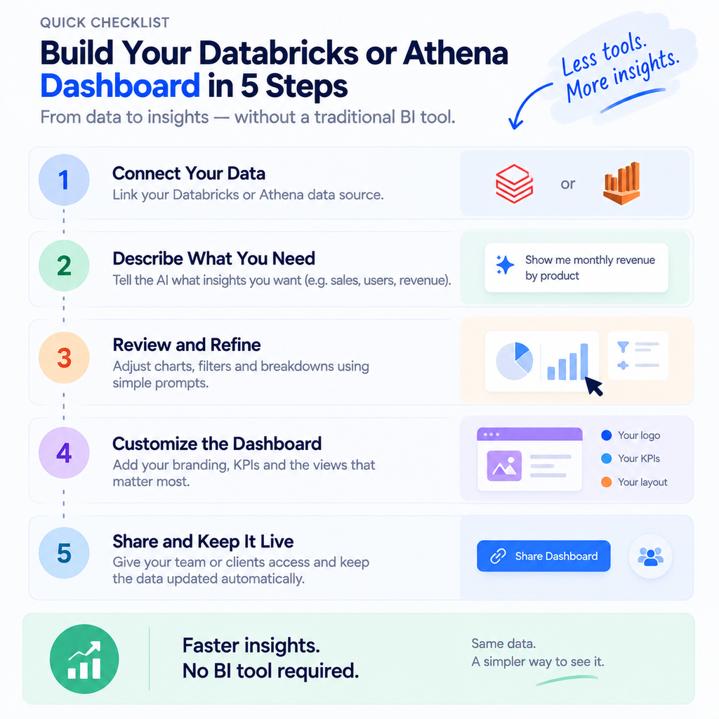
If you’re evaluating this path, here’s a practical starting checklist:
- Confirm your data source: Databricks SQL endpoint (serverless or provisioned) or Athena query engine connected to S3
- Choose a live-query connector: avoid tools that import or cache data (SPICE-style), which introduce refresh lag and duplication
- Connect without moving your data: your data stays where it is; the dashboard reads it in place
- Build your first dashboard using natural language or a low-code interface, charts, KPIs, filters, and tables without writing SQL from scratch
- Share with stakeholders via link: no BI viewer licence required for the people consuming the dashboard
This is the architecture that removes the BI layer without removing the governance or the speed.
Your Data Is Ready. Your Dashboard Shouldn’t Require Another Contract.
The work of building a reliable data layer, ingesting, transforming, governing is already done. Databricks and Athena handle that exceptionally well. The dashboard shouldn’t undo that investment by requiring a new vendor, a new licence negotiation, and a new tool for your team to learn.
Connect your Databricks workspace with Papercrane and build your first dashboard without touching a BI tool. Or connect AWS Athena and turn your S3 queries into shareable, live dashboards in minutes. The stack is already there. The dashboard should be the easy part.