Category: Business Intelligence

  • Databricks & Athena Dashboards Without the BI Overhead

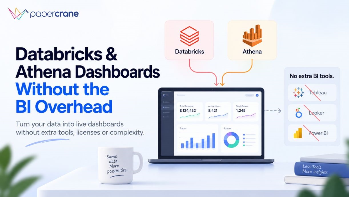
    Databricks & Athena Dashboards Without the BI Overhead

    You’ve already done the hard part. The data is ingested. The pipelines are running. Your Databricks lakehouse is humming, or your Athena queries are firing against S3 on demand.

    And then someone in a meeting asks for a dashboard, and suddenly you’re being quoted $75 per user per month for Tableau, or spending a Friday afternoon debugging QuickSight embed configs.

    This is the BI overhead trap. And for lean data teams, it’s the part of the stack that quietly eats your budget and your time.
    Why Databricks and Athena Users Keep Adding BI Tools They Didn’t Want

    Databricks is a lakehouse and processing platform. AWS Athena is a serverless SQL query engine that runs directly over S3 data. Neither was designed to be a business intelligence layer, and that gap creates a recurring problem.

    Databricks did launch AI/BI (formerly Lakeview Dashboards) in 2024, and it’s evolved quickly. The platform now lets teams unlock and share insights from their data without the need for a separate BI system. But there’s a catch: Databricks AI/BI only works with data governed under Unity Catalog, inside Databricks itself.

    If your data lives elsewhere or if your stakeholders need a polished, standalone dashboard experience, you’re back to bolting on another tool.

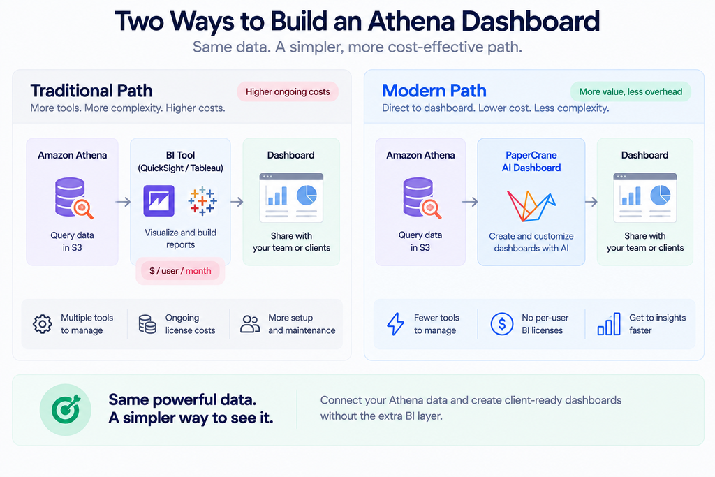
    Athena has it worse. It’s a query engine, full stop. There is no native visualization layer. The standard path is Athena → QuickSight, but that introduces Author licenses, SPICE dataset refresh delays, and a UI that many non-AWS users find alienating. The alternative is Athena → Tableau or Power BI via ODBC connector, reintroduces the per-seat licensing overhead you were trying to avoid.

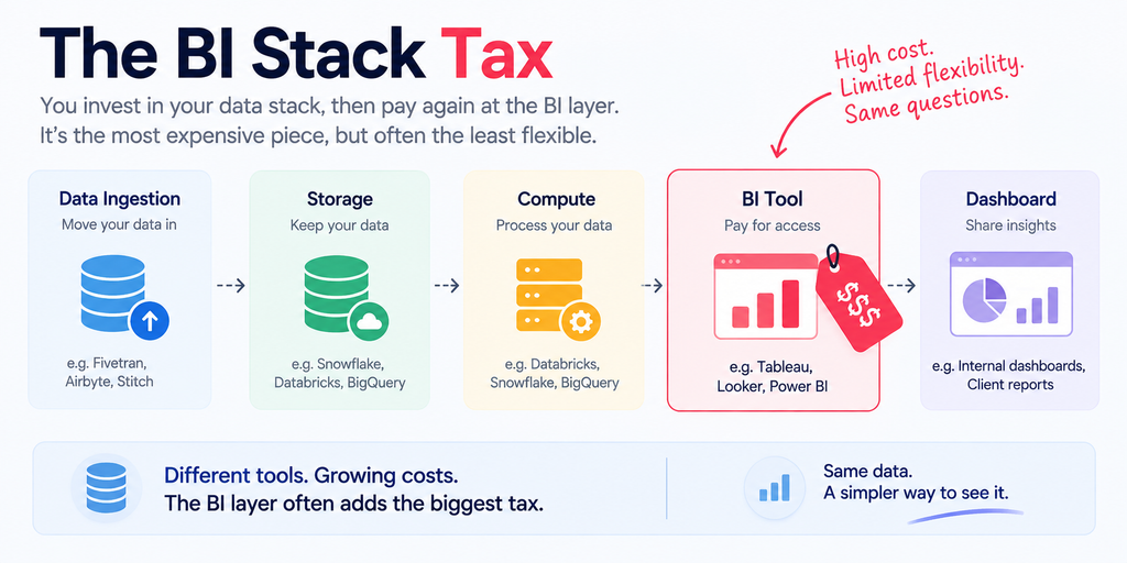
    The result is predictable: a working Databricks analytics setup often requires five tools and five contracts before a single dashboard appears. Databricks or Athena for compute, Fivetran or Airbyte for ingestion, dbt for transformation, a BI tool for visualization, and an orchestration layer to hold it together. That’s five vendors, five renewal conversations, and five support queues.

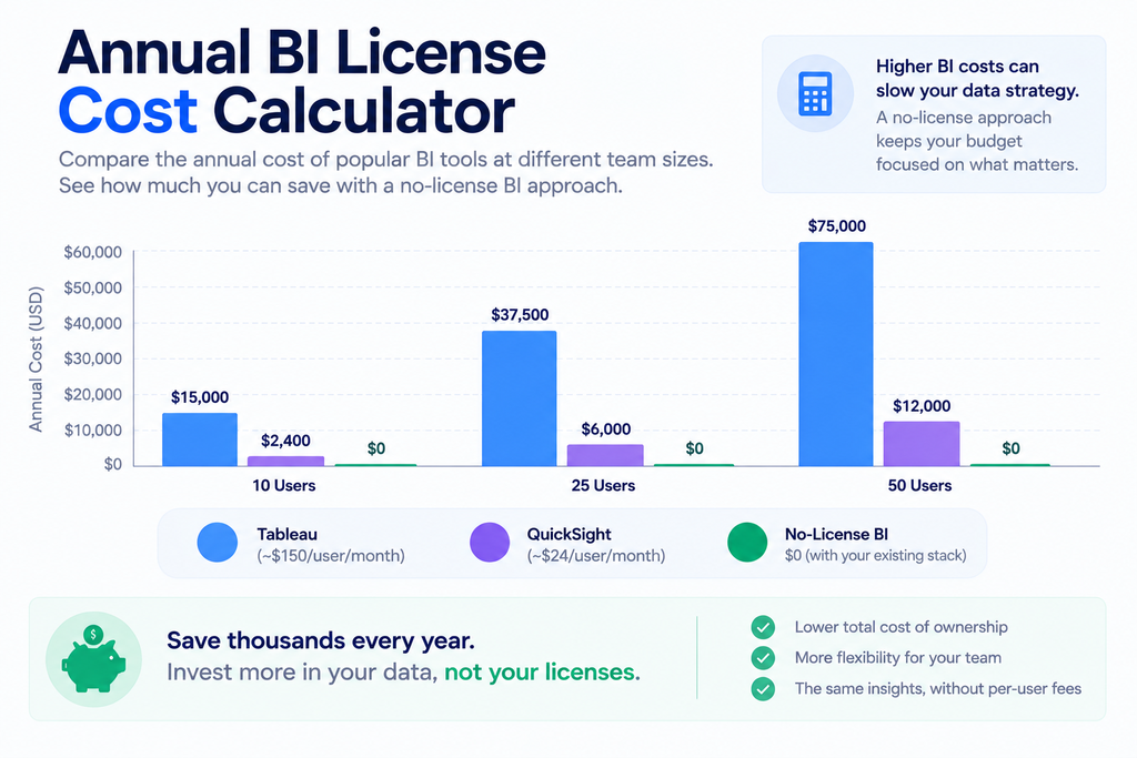
    What “Just Add Tableau” Actually Costs a 20-Person Team

    The math on BI licensing is rarely laid out plainly, so here it is.

    The Creator licence for Tableau Standard runs around $75 per user per month, which covers Desktop, Prep, and Server access. Explorer licences for analysts who build on existing data sources come in at around $42 per month. Viewer licences for stakeholders who only need to consume dashboards are $15 per month each. A 10-person team with a mix of creators and viewers can easily land at $7,000–$9,000 per year before factoring in Tableau Server infrastructure.

    QuickSight looks cheaper at first glance, an Author licence starts at $18/month but the per-session reader model ($0.30 per session, capped at $5/month per user) adds up unpredictably as dashboard usage scales. And it comes with its own overhead: no version control, dashboards that auto-save by default, limited customization for complex visual layouts, and API automation that turns frustrating fast.

    Beyond the licence fees, there are the invisible costs: onboarding time, semantic layer duplication (defining the same metrics in both your data warehouse and your BI tool), connector maintenance as schemas evolve, and the engineering hours spent administering a platform that isn’t core to your product.

    According to Databricks’ engineering data, poorly optimized BI queries account for up to 35% of wasted SQL Warehouse compute in enterprise deployments, meaning the BI layer is actively working against the efficiency of your compute layer.

    The question isn’t whether BI tools have value. They do. The question is whether your team actually needs one to get dashboards in front of stakeholders.
    What Databricks SQL Dashboards Can (and Can’t) Do Natively

    Before looking at alternatives, it’s worth understanding where Databricks AI/BI Dashboards genuinely shine, and where the edges are.

    On the strong side: Databricks SQL Dashboards (built on the AI/BI layer) now support multi-page reporting, calculated measures, global filters, AI-assisted authoring, and scheduled email subscriptions for PDF snapshots.

    Performance has improved dramatically, dashboards that previously took 10 seconds to load now render in around 2 seconds with DBSQL Serverless, without requiring any manual index tuning or configuration. For databricks visualization inside the platform, this is a meaningful native option.

    The limitations are real, though. AI/BI Dashboards only work with data registered in Unity Catalog. Cross-dataset filtering across multiple data sources is a known friction point that the community has flagged repeatedly.

    Map visuals remain limited. And if your business users need to take action from inside the dashboard, updating a forecast, assigning a flag, routing an approval the platform doesn’t support write-back.

    Most importantly for this article: if your data lives in S3 and you query it through Athena, Databricks’ native dashboard layer doesn’t help you at all. You need a different path.

    Ready to skip the setup friction? You can connect your Databricks workspace to a dashboard without configuring a separate BI tool.

    Why Building an Athena Dashboard Feels Harder Than It Should

    Amazon Athena is genuinely excellent for what it does. It’s serverless, it runs standard SQL directly over S3 data in formats like Parquet and CSV, and you only pay for the queries you run.

    There’s no infrastructure to manage, no clusters to size, and no minimum commitments. For ad hoc analysis and exploratory queries, it’s hard to beat.

    But Athena is a query engine, not a dashboard platform. The moment a stakeholder asks to see a chart updated daily, you need something else. The standard AWS answer is QuickSight, and for teams already deep in the AWS ecosystem with dedicated BI authors, that can work.

    But QuickSight has documented pain points: no version control for dashboards, limited support for complex geospatial data, clunky promotion between environments (dev → staging → prod), and self-service analytics that require Creator licences to function, which aren’t cheap.

    The alternative connector path, using Tableau or Power BI via the Athena ODBC driver or the official Power BI connector, reintroduces the full weight of enterprise BI licensing. Teams that previously needed only Athena (pay-per-query, no ongoing costs) suddenly find themselves committed to an $18–$75/user/month BI subscription with its own maintenance surface.

    The pattern teams keep rediscovering: Athena makes the data cheap and fast to query. The visualization layer makes it expensive and slow to ship.

    You can connect AWS Athena directly to a dashboard and skip the BI middleware entirely.
    What a Modern Databricks & Athena Dashboard Setup Actually Looks Like

    The good news is that the category has moved. There’s now a class of AI-native dashboard builders designed specifically for teams that already have a strong data layer, and don’t want to add another BI contract on top of it.

    The key difference from traditional BI tools is the connection model. Instead of importing data into a proprietary engine (like QuickSight’s SPICE) or requiring a desktop client to connect (like Tableau Desktop), AI-native dashboard builders connect directly to your Databricks SQL endpoint or your Athena query engine as a live data source.

    Queries run against your actual data at query time. There’s no duplication, no refresh schedule to manage, and no semantic layer to maintain in parallel.

    For a databricks sql dashboard built this way, the workflow looks like this: connect to your SQL warehouse endpoint, point at the tables or views you care about, describe the chart or metric you want in plain language, and share the result via a link. No Tableau Server to configure. No QuickSight SPICE datasets to refresh. No separate admin panel for user permissions.

    For Athena, the same principle applies, a direct connection to your Athena endpoint means your S3 data is queryable in seconds, and the dashboard reflects live query results rather than a stale import.

    If your team is already building dashboards without writing SQL by hand, this extends naturally. You can read how teams are doing this with the Papercrane AI dashboard builder without SQL approach. And if you’ve seen how quickly this works on other cloud warehouses, the Snowflake dashboard in minutes pattern translates directly.

    You Don’t Have to Throw Out Tableau

    A fair caveat before the checklist: Tableau and Power BI aren’t bad tools. For large enterprises with dedicated BI teams, complex embedded analytics requirements, and hundreds of governed reports built over years, they’re genuinely the right answer.

    The ecosystem, the visualization depth, and the enterprise support tiers all justify the cost at that scale.

    But that’s not the situation most data teams reading this are in. If you’re a team of two to ten people, if your data already lives in Databricks or Athena, and if what you actually need is reliable dashboards in front of decision-makers, the overhead of a full BI platform is largely unnecessary.

    The databricks reporting and databricks bi use cases for lean teams don’t require a $75/user/month tool. They require a fast, governed connection to data you already have.

    The BI overhead question is a fit question, not a capability question.

    Ready to Build a Databricks or Athena Dashboard Without the BI Layer?

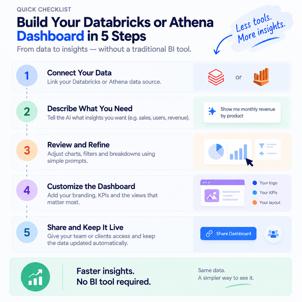
    If you’re evaluating this path, here’s a practical starting checklist:

    1. Confirm your data source: Databricks SQL endpoint (serverless or provisioned) or Athena query engine connected to S3
    2. Choose a live-query connector: avoid tools that import or cache data (SPICE-style), which introduce refresh lag and duplication
    3. Connect without moving your data: your data stays where it is; the dashboard reads it in place
    4. Build your first dashboard using natural language or a low-code interface, charts, KPIs, filters, and tables without writing SQL from scratch
    5. Share with stakeholders via link: no BI viewer licence required for the people consuming the dashboard

    This is the architecture that removes the BI layer without removing the governance or the speed.
    Your Data Is Ready. Your Dashboard Shouldn’t Require Another Contract.

    The work of building a reliable data layer, ingesting, transforming, governing is already done. Databricks and Athena handle that exceptionally well. The dashboard shouldn’t undo that investment by requiring a new vendor, a new licence negotiation, and a new tool for your team to learn.

    Connect your Databricks workspace with Papercrane and build your first dashboard without touching a BI tool. Or connect AWS Athena and turn your S3 queries into shareable, live dashboards in minutes. The stack is already there. The dashboard should be the easy part.
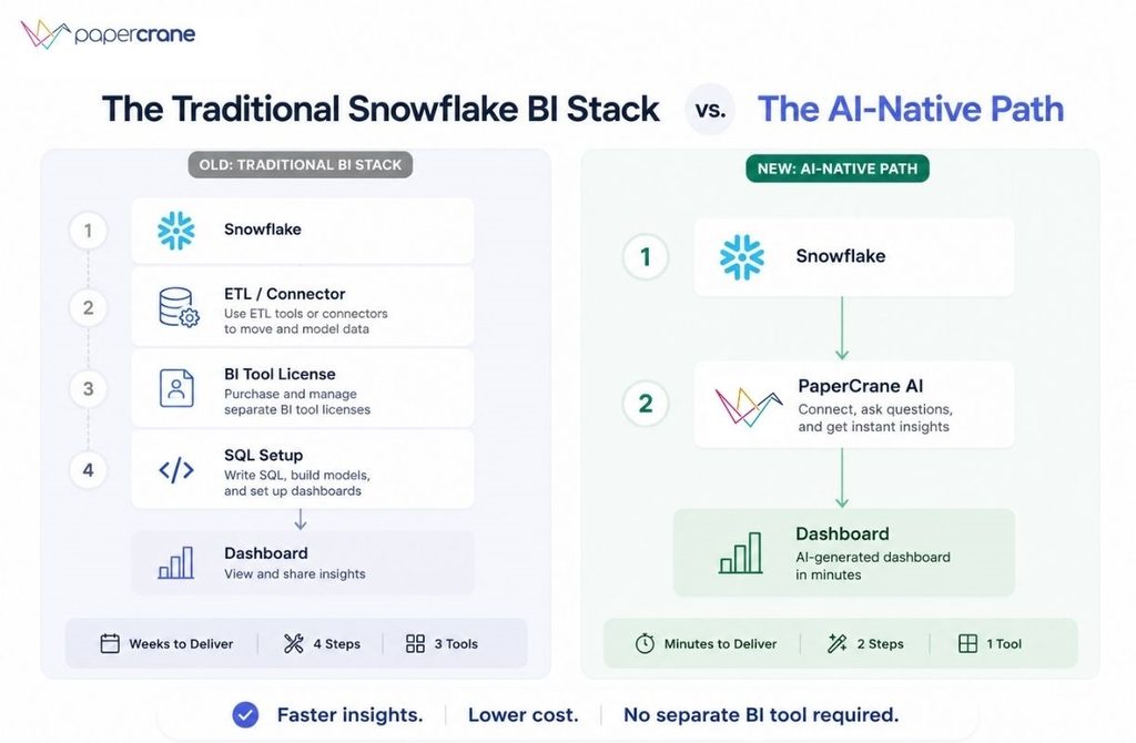
  • Snowflake Dashboard in Minutes: BI Without a Separate Tool

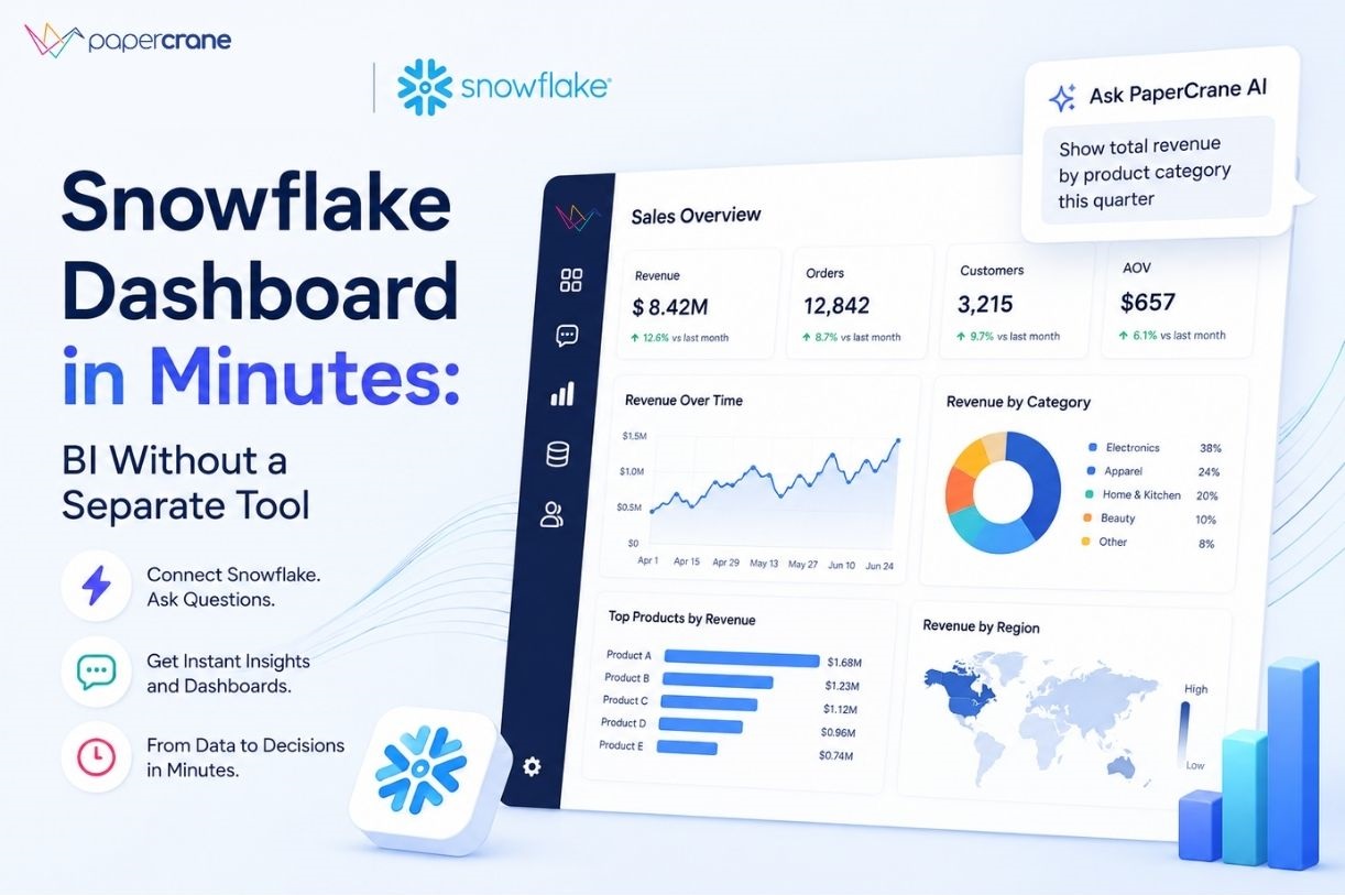
    Snowflake Dashboard in Minutes: BI Without a Separate Tool

    You built the data warehouse. You migrated to Snowflake, modeled your tables, and finally have clean, reliable data in one place. The hard part is supposed to be over.

    But when your CEO asks for a revenue chart, someone opens a ticket for the analyst. When your marketing lead wants to see this week’s campaign spend, someone exports a CSV. Your data is ready. Your team’s access to it isn’t.

    The standard advice, buy Tableau, configure Power BI, stand up Looker, sounds reasonable until you’re three weeks into onboarding, paying $50 per seat, and your stakeholders still can’t open a live dashboard without asking for help. That’s not a visibility solution. That’s a second problem dressed up as a fix.

    Why Snowflake’s Native UI Isn’t a Real Dashboard Solution

    Snowflake ships with a built-in interface called Snowsight. You can run SQL there and see a chart. For a data engineer doing exploratory analysis, that’s genuinely useful.

    For your marketing manager, your CFO, or your ops lead, it’s a dead end. Snowsight requires SQL to get anything out of it. There’s no shareable live dashboard, no auto-refresh, no drill-down your non-technical teammates can navigate on their own. It’s a query tool that happens to draw charts, not a snowflake dashboard your whole team can actually use.

    So the natural next move is adding a dedicated BI tool. And that’s where the “tool tax” kicks in.

    The Real Cost of Traditional Snowflake BI Tools

    Layering Tableau, Power BI, or Looker on top of Snowflake typically means: a new vendor contract, a 2-4 week onboarding project, per-seat licensing that compounds with every new hire ($15-$75/user/month depending on the tool), and Snowflake compute credits burning on every query a dashboard runs. For a 10-person team, that’s often $5,000–$10,000 per year in BI licensing, before a single dashboard is live.

    The problem isn’t the visualization. The problem is that every traditional snowflake dashboard tool was designed around the assumption that you have a dedicated data team to set it up and maintain it. Most growing teams don’t.

    What a Real Snowflake Analytics Dashboard Should Do

    Before getting into how PaperCrane solves this, it’s worth being clear on what “good” actually looks like. The bar is higher than most teams realize when they’re stuck in the old model.

    A proper snowflake analytics dashboard should:

    • Connect live to your Snowflake tables: No CSV exports, no manual data pulls, no staging copies
    • Work for non-technical users: Anyone on your team should be able to open it, filter it, and understand it without writing a query
    • Refresh automatically: The numbers your team sees should reflect what’s actually in Snowflake today, not last Tuesday
    • Alert you when something changes: Proactive notifications when a metric crosses a threshold, not reactive scrambles after a stakeholder spots a problem
    • Take minutes to set up, not weeks: Your first dashboard should be live the same day you connect your data

    Most traditional snowflake bi tools check one or two of these boxes. They weren’t designed to check all five for a team without a dedicated BI engineer. PaperCrane was.

    How to Build a Snowflake Dashboard with PaperCrane in Minutes

    This is the part every competitor blog skips. They tell you to “connect Tableau to Snowflake” and leave you with a 40-step setup guide. Here’s what it actually looks like with an AI-native tool built for this exact use case.

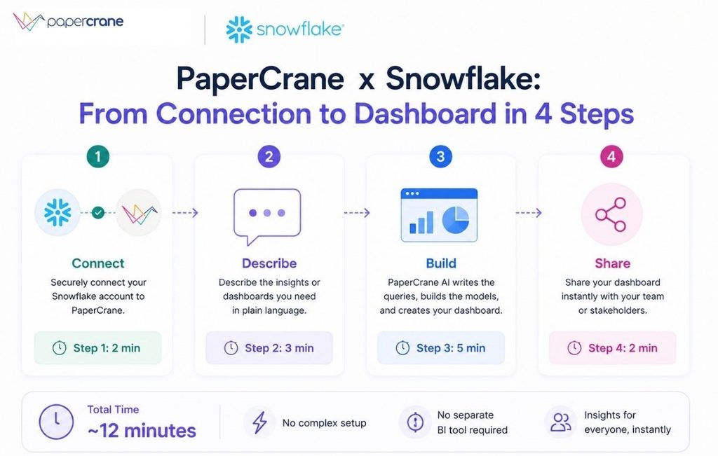
    Step 1: Connect Your Snowflake Account Under 2 Minutes

    Go to PaperCrane’s Snowflake connector and enter your Snowflake account URL and credentials. That’s it. No ETL pipeline to configure. No data copying to a separate environment. Your Snowflake data stays exactly where it is, PaperCrane reads it directly.

    What happens behind the scenes: PaperCrane automatically scans your database schema, maps your tables and views, and identifies the relationships between them. You don’t need to explain your data model or draw an ERD. The AI does that work.

    Step 2: Describe What You Want In Plain English

    No SQL. No drag-and-drop query builder. Just type what you want to see.

    “Show me monthly revenue by product for the last quarter.” “What’s our customer acquisition cost by channel this month?” “Compare this week’s conversion rate to the same period last month.”

    PaperCrane translates your request into an optimized Snowflake query, runs it, and renders the right chart type automatically. You see bar chart, line graph, KPI scorecard, cohort table, whatever fits the shape of the data. If the first output isn’t quite right, you refine it in plain language. No one writes SQL. That’s the point.

    If you want to understand more about how this works under the hood, this breakdown of AI dashboard builders that work without SQL goes deeper into the mechanics.

    Step 3: Build Your Full Dashboard: Arrange, Filter, Share

    Pin your charts to a dashboard. Add date-range filters. Set up segment filters by region, channel, product, team, whatever dimensions your data has. Create drill-down paths so a stakeholder can click into a number and understand where it came from, without pinging an analyst.

    PaperCrane suggests relevant charts based on the tables you’ve connected and fills in a starter dashboard layout so you’re not staring at a blank canvas. Anyone on your team can adjust their view without touching the shared version.

    Step 4: Automate Refresh, Set Alerts, and Share

    Set your refresh schedule to hourly, daily, or on-demand. Configure threshold alerts: “Notify me when ROAS drops below 2x” or “Flag when CAC exceeds our monthly target.” Share via a secure link, embed in Notion or your internal portal, or export to PDF for weekly reporting.

    PaperCrane handles all query scheduling against Snowflake, optimizes query patterns to minimize compute credit consumption, and manages permission levels so the right people see the right data. Your first dashboard can be live, genuinely live, with real Snowflake data, shared with your team in under 15 minutes.

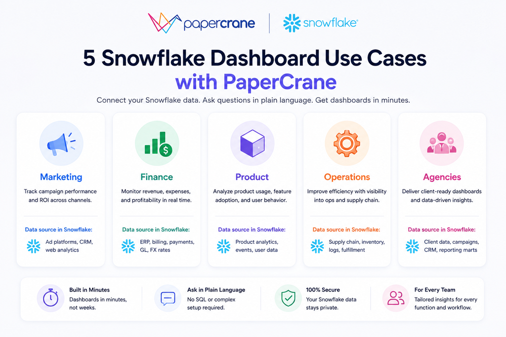
    What Teams Actually Build: Snowflake Dashboard Examples with PaperCrane

    The steps above tell you how. Here’s what teams actually produce once they’re connected.

    Marketing Teams for Campaign Performance Dashboards

    Ad spend, ROAS, and channel attribution data sits in Snowflake. PaperCrane pulls it into a live snowflake analytics dashboard. Spend by channel, cost per acquisition by campaign, week-over-week trend lines, without a single CSV export or SQL query. Marketing managers check it every morning like a weather report.

    Revenue and Finance Teams for Live MRR and P&L Reporting

    Connect your Snowflake finance tables and ask PaperCrane to build an MRR dashboard with churn rate, expansion revenue, and LTV breakdowns. Updated daily. Shared with leadership via a link. No more waiting for the analyst to run the monthly report or reconciling three different versions of the same number.

    Product and Growth Teams for Funnel and Retention Dashboards

    Event tables in Snowflake hold every click, signup, and feature interaction your users produce. PaperCrane turns them into funnel visualizations, cohort retention charts, and feature adoption breakdowns, the kind of snowflake data visualization that used to require a dedicated product analytics tool and a data engineer to maintain it.

    Operations Teams for Real-Time Operational Dashboards

    Inventory levels, SLA compliance, fulfillment rates, ops data lives in Snowflake, but ops managers can’t write SQL. PaperCrane gives them a live dashboard for snowflake data they can check every morning without involving IT. Problems surface before they become escalations.

    Agencies and Client Reporting for Embeddable White-Label Dashboards

    If you manage client data in Snowflake, PaperCrane lets you build branded, embeddable dashboards and share them as white-labeled links. Clients see clean, live snowflake reporting with no Snowflake login, no BI tool seat, and no technical setup on their end.

    According to Snowflake’s Modern Marketing Data Stack report, marketing teams are centralizing more data in Snowflake than ever, but the visibility gap between what’s in the warehouse and what stakeholders can actually see remains one of the top operational frustrations.

    PaperCrane vs. Traditional Snowflake BI Tools

    Now that you’ve seen what PaperCrane actually does, the comparison to traditional tools lands differently than a spec-sheet comparison would.

    CriteriaTableau / Power BI / LookerPaperCrane
    Setup time1-4 weeksUnder 15 minutes
    SQL requiredYes, for any custom dashboardNo, plain English
    Licensing cost$15–$75/user/monthIncluded
    Non-technical usersView-only in most tiersFull self-service
    AI-nativeBolt-on featureCore function
    Snowflake connectionRequires connector configurationDirect, automatic
    Compute optimizationManual tuning requiredBuilt-in
    First dashboard liveDays to weeksSame session

    For teams who’ve already looked at traditional snowflake bi tools and felt the weight of onboarding, licensing, and SQL dependency. PaperCrane is built on a different assumption: that your team shouldn’t need a data engineer just to see their own data.

    You can compare PaperCrane directly against other Snowflake tools here if you’re mid-evaluation.

    According to Gartner’s 2025 Magic Quadrant for Analytics and BI Platforms, ease of use and time-to-insight are now the top evaluation criteria for BI tool selection, overtaking raw visualization capability for the first time. That shift is exactly what AI-native tools like PaperCrane are built for.

    Frequently Asked Questions

    Can Snowflake create its own dashboards?

    Snowflake includes a native interface called Snowsight that can display charts from SQL query results, but it requires SQL knowledge and isn’t designed for business users or ongoing team reporting. For a production snowflake dashboard your whole team can access and act on, you need a dedicated tool. Ideally one that connects directly to Snowflake without requiring SQL.

    What is the easiest way to build a dashboard on Snowflake?

    The easiest path to a live snowflake analytics dashboard is an AI-native tool like PaperCrane. You connect your Snowflake account, describe what you want to see in plain English, and the AI builds and renders the dashboard. No SQL, no BI tool license to configure, no onboarding project.

    Does building dashboards on Snowflake cost extra compute?

    It can. Traditional snowflake bi tools that run live queries on every dashboard refresh do consume compute credits with each page load. PaperCrane optimizes query patterns and uses result caching to minimize credit consumption, so your snowflake reporting costs stay predictable as your team grows.

    Do I need Tableau or Power BI to visualize Snowflake data?

    No. Tableau, Power BI, and Looker are well-known options for snowflake data visualization, but they’re not the only path. And for teams without a dedicated data engineer, they often create more friction than they solve. AI-native tools connect directly to Snowflake and let non-technical users build and share dashboards without a separate BI license or SQL expertise.

    How long does it take to build a working Snowflake dashboard

    With a traditional snowflake dashboard tool, setup typically takes one to four weeks including connector configuration, data modeling, and user training. With PaperCrane, the average time from connecting your Snowflake account to sharing your first live dashboard is under 15 minutes.

    Your Snowflake Data Is Ready. Your Dashboard Should Be Too.

    The data is already in Snowflake. The problem has never been storage, it’s been the gap between raw tables and the insights your whole team can open, understand, and act on without asking for help.

    That gap used to require an analyst, a BI license, weeks of setup, and ongoing SQL maintenance. It doesn’t anymore.

    PaperCrane connects to your Snowflake account, reads your schema, and turns your data into a live, shareable snowflake dashboard in minutes, no SQL, no separate BI tool, no onboarding project. Marketing managers, finance leads, ops teams, and executives can all see the same live data, filtered to what they care about, updated automatically.

    If you’re already paying for Snowflake, you’ve already done the hard part. Connect your Snowflake account and build your first dashboard free →

    And if you’re curious how this compares to building analytics dashboards for other data sources, see how Stripe analytics dashboards are built the same way →

  • HubSpot Reporting Dashboard: What Native Reports Miss

    HubSpot Reporting Dashboard: What Native Reports Miss

    You built the report. Then someone asked a question it can’t answer, because the data lives in two objects HubSpot won’t let you join, or in a tool HubSpot has never heard of.

    This is the point where most teams start searching for “hubspot reporting dashboard,” and it’s usually not curiosity. It’s a specific report that’s stuck.

    We cover why native HubSpot reporting hits that wall, what a custom HubSpot CRM dashboard actually needs to do instead, and how to build one without waiting on a subscription upgrade or a dev sprint.

    Why Teams Hit a Wall With HubSpot’s Native Reporting

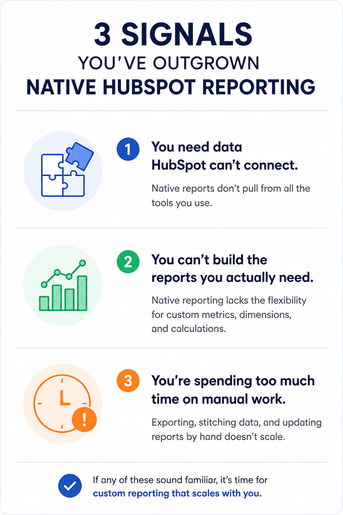
    HubSpot’s report builder is genuinely good for single-object questions like deals by stage, contacts by source, tickets by rep. It starts to strain the moment a question crosses objects or crosses systems.

    A few concrete triggers:

    • Report caps tied to subscription tier. On the HubSpot Community forum, one team had around 20 paid Sales Hub Professional seats. They hit the plan’s 100-report limit. Moving to Enterprise would raise the limit to 3,000 reports, but the team did not need that much capacity. The higher-tier cost also did not make sense for their needs.Their proposed fix, a smaller, cheaper increment instead of an all-or-nothing tier jump, is still just a community suggestion, not a shipped feature.
    • The cross-object ceiling. HubSpot’s documentation confirms that custom report limits vary by subscription. Limits do not combine across multiple hubs on the same tier. Increasing the limit requires a reporting limit add-on, rather than changing a setting.
    • Data outside HubSpot stays outside HubSpot. Revenue collected in Stripe, spend sitting in an ad platform, anything in a warehouse. None of it shows up in a native report without a pre-built integration first.
    • The build itself takes longer than it should. In G2 reviews of HubSpot, users describe dashboards as complex to build in a short window. Getting at the underlying data as something that takes real time spent “connecting the dots” rather than a quick lookup.

    None of this makes HubSpot’s reporting bad. It means native reporting is scoped to what fits inside HubSpot’s object model, and plenty of real reporting questions don’t.

    What Agencies and RevOps Teams Actually Need From a Custom Report

    The keyword is “custom report,” but the actual need is rarely about report types. It’s about specific comparisons:

    • Deal data next to the revenue Stripe actually collected, not just the stage a deal sits in
    • Ad spend next to the pipeline it generated, across a full funnel HubSpot only sees half of
    • The same underlying numbers, reformatted for a client, an exec, and a sales rep without rebuilding it three times

    That’s the actual shape of a “hubspot crm dashboard” request once you strip away the feature vocabulary. It’s a cross-source question wearing a HubSpot label.

    The Old Workaround and Why It Breaks

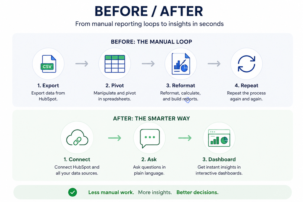
    Before a better tool enters the picture, most teams solve this the same way: export to a spreadsheet, rebuild the pivot table, reformat it for whoever’s asking, send it, and repeat the whole thing next week when the numbers move.

    It works exactly once. Every new question restarts the cycle, the export is stale the moment it’s downloaded, and an agency running this process across multiple client accounts is rebuilding the same pivot table by hand, over and over, for people who just wanted an answer.

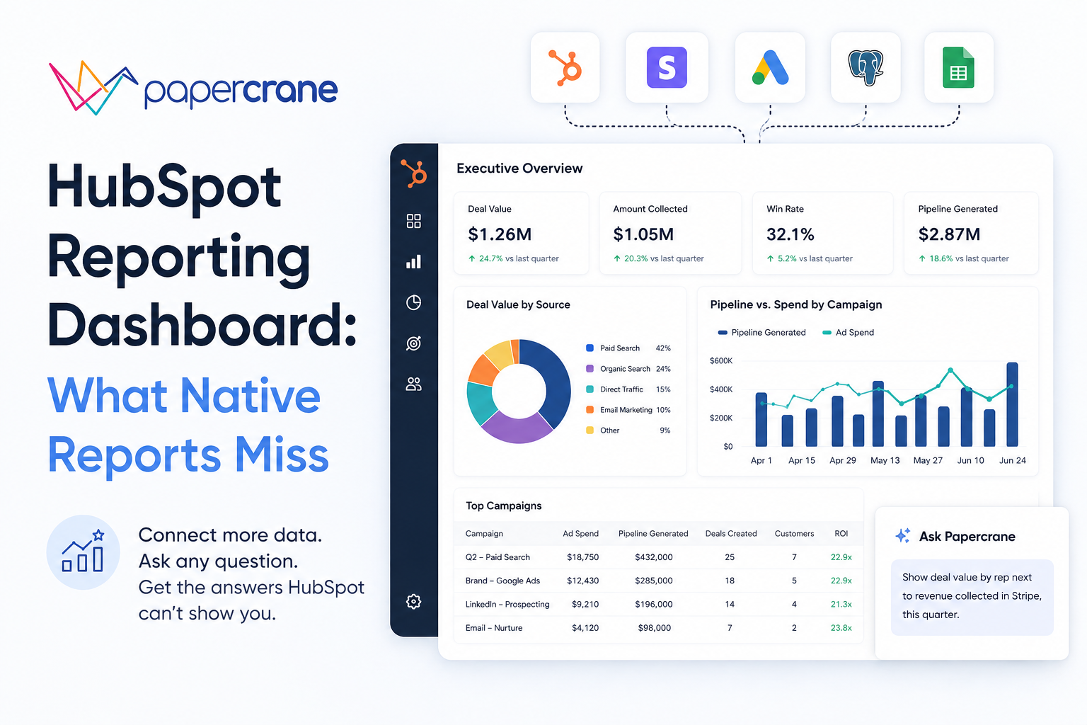
    How Papercrane Builds HubSpot Reporting Dashboards Without the Native Limits

    Papercrane connects to HubSpot alongside your other data sources, such as Stripe, ad platforms, and databases.

    You do not need to pre-build the join logic yourself.

    Instead of configuring axes, filters, and chart types inside HubSpot’s report builder, you describe the report in plain language.

    For example:

    “Show deal value by rep next to revenue actually collected in Stripe, this quarter.”

    Papercrane then builds the dashboard from your request.

    Two follow-up questions often matter more than the first one.

    If the next question is, “Now break that down by lead source,” you ask it directly.

    If you want to ask, “Compare it to last quarter,” you ask that too.

    You do not need to rebuild the report from scratch each time.

    You also avoid limits tied to how many two-axis reports your HubSpot tier supports.

    Cross-object and cross-platform questions become prompts rather than subscription-tier decisions.

    HubSpot Sales Dashboard vs. Marketing Dashboard

    The two use cases need genuinely different data, and both routinely need data HubSpot alone doesn’t have:

    Sales dashboard: pipeline by rep, deal velocity, win rate, joined with revenue actually collected, not just the deal stage marked “closed won.”

    Marketing dashboard: campaign-to-pipeline attribution and spend against the pipeline it produced.

    This gives you the cross-object, cross-platform view HubSpot’s native reporting is least equipped to answer in one place.

    Spend data usually lives in the ad platform, not HubSpot.

    Same underlying need either way: the dashboard should follow the business question, not the object HubSpot happens to store the data in.

    Getting Started in Minutes, Not a Reporting Sprint

    This matters most for agencies managing reporting across several client accounts at once.

    Nobody should need to file a ticket to a dev team or wait for the next sprint to get a dashboard built.

    With Papercrane, an account manager can ask for the dashboard directly, the same way they’d ask a colleague, and get it back in minutes instead of days.

    That’s the practical case for agencies specifically: the reporting bottleneck usually isn’t the data, it’s the queue to get someone to build the report.

    FAQs

    Can I connect HubSpot with non-HubSpot data in one dashboard?

    Yes. Papercrane connects HubSpot alongside sources like Stripe or ad platforms so a single dashboard can report across all of them. HubSpot’s native reporting can’t do without a separate integration built in advance.

    Do I need to upgrade my HubSpot tier to get more custom reports?

    Within HubSpot itself, yes report limits are tied to subscription tier, and increasing them means either upgrading or purchasing a reporting limit add-on, per HubSpot’s own documentation. Building the report outside HubSpot’s report builder sidesteps that limit entirely.

    Can I build a HubSpot dashboard without knowing SQL or the report builder’s filter logic?

    Yes, with Papercrane you describe what you want in plain language rather than configuring data sources, fields, and filters manually.

    Ready to see it on your own data?

    Connect your HubSpot account and ask for the dashboard you’ve been exporting to a spreadsheet every week, or see how agencies use Papercrane to handle reporting across every client account from one place.

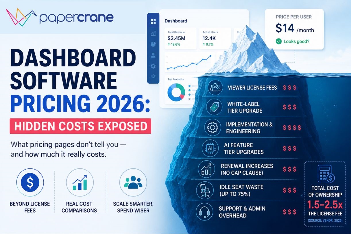
  • Dashboard Software Pricing 2026: Hidden Costs Exposed

    Dashboard Software Pricing 2026: Hidden Costs Exposed

    A CFO signed a Tableau contract. The plan looked reasonable, a manageable per-user number.

    Six months in, between implementation consulting, data prep, training, and the support tier he didn’t know was optional, his team had spent well over what the license alone implied.

    Seventy-five percent of his employees still used Excel.

    That story isn’t an outlier. It’s the standard arc for business intelligence pricing in 2026.

    The gap between what dashboard software says it costs and what it actually costs is one of the most consistently underestimated line items in a modern tech budget.

    Why BI Pricing Is So Hard to Decode in 2026

    You’re no longer choosing between “cheap” and “expensive”, you’re navigating six incompatible models: per-seat, per-capacity, MAU-based, consumption credits, flat-rate, and hybrid.

    A tool that looks affordable on the pricing page can cost 3x more once you factor in viewers, white-labeling, and AI add-ons.

    Two events in 2025 made this worse. First, Microsoft raised Power BI Pro from $10 to $14 per user per month, a 40% hike applied to existing customers at renewal, with minimal warning.

    Second, AI features became the headline marketing claim for every BI vendor, but almost universally those features are gated behind premium tiers that cost multiples of the base plan.

    The median cheapest monthly BI plan across the market is $49. The average is $379, pulled upward dramatically by a handful of enterprise-first products.

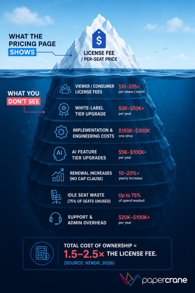
    The 5 Hidden Costs Nobody Puts on Their Pricing Page

    1. Viewer and User License Fees

    Most platforms charge depending on what users do, build dashboards vs. view them vs. explore data. The split sounds reasonable until you model it for a real team.

    For embedded analytics, dashboards inside your own SaaS product for customers, the problem is sharper.

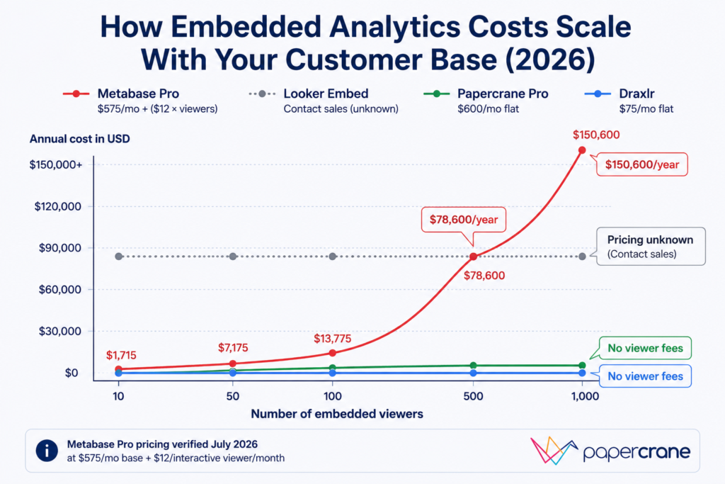
    Metabase Pro (verified July 2026) charges $575/month base plus $12/month per interactive viewer.

    Five hundred customers viewing your embedded dashboard means $6,000/month in viewer fees on top of the base plan, $78,600/year before a single implementation dollar is spent.

    The rule: always model the cost at your current user count and at 2x and 5x that count before signing.

    2. White-Label Fees

    If you need to embed dashboards in your product without another company’s logo on it, you need white-labeling. Almost every vendor offers it, at a much higher tier than their entry price.

    Always ask “what tier includes white-labeling?” before evaluating any other feature, especially for customer-facing use cases. Jumping tiers for white-label access alone commonly doubles or triples the contract value.

    3. Implementation Costs

    Vendors rarely mention this, but Vendr’s procurement data across BI platforms consistently shows total cost of ownership runs 1.5 to 2.5x the annual license fee when you include implementation, infrastructure setup, training, and ongoing administration.

    For embedded analytics platforms specifically, engineering infrastructure, multi-tenancy, row-level security, and governance, commonly adds $150,000 to $300,000 in first-year costs that never appear on the pricing page.

    Forrester’s research estimates up to 80% of IT budget gets consumed by maintenance costs after the initial build, leaving only 20% for new capability.

    The 29% of teams who built in-house analytics regretted it within one year. The math explains why.

    4. AI Features That Require a Full Tier Upgrade

    Every BI vendor’s homepage leads with AI in 2026. Almost none include meaningful AI in their base plan.

    • Power BI Copilot: Requires Fabric capacity, not available on the $14/user Pro plan. The entry-level Fabric F64 tier that eliminates per-user viewer licenses costs approximately $8,410/month pay-as-you-go or $4,982/month on a 1-year reservation (verified July 2026, US region)
    • Tableau Agent and Pulse: Included from Standard tier, but agentic capabilities (Tableau Next) require the Tableau+ Bundle, contact sales only.
    • Metabase Metabot AI: Add-on at $100/month for 500 requests, not included in base plans

    The pattern is consistent: AI is the headline feature, but the useful version is always further up the pricing ladder.

    5. Renewal Increases and Multi-Year Lock-In

    Tableau requires annual contracts, no month-to-month option exists. Documented cases show support fees jumping significantly at renewal, and there is no standard renewal cap in base agreements.

    Power BI pricing comparison in April 2025 was applied to existing contracts at renewal. Domo customers have reported renewal increases in the hundreds of percent.

    These aren’t edge cases, they’re standard commercial behavior from large BI vendors operating in a market where switching costs are high.

    Business Intelligence Pricing by Tool

    Microsoft Power BI

    PlanMonthly Cost
    DesktopFree (Windows only)
    Pro$14/user/month (raised 40% from $10 in April 2025)
    Premium Per User (PPU)$24/user/month
    Fabric F64 (pay-as-you-go)$8,410/month (eliminates viewer licenses at this tier and above)
    Fabric F64 (1-year reserved)$4,982/month (41% savings vs. pay-as-you-go)

    Source: Microsoft Power BI official blog (November 2024), Solv Systems Fabric pricing guide (July 2026)

    Reality check: Power BI Pro looks affordable at $14/user/month until you need AI features (Fabric), white-labeling (Fabric), or to eliminate viewer licensing at scale (requires F64 or above).

    The $14/user plan is a reporting tool, not a full analytics platform pricing.

    Best for: Microsoft-stack organizations (M365, Azure, Dynamics) with dedicated BI talent who don’t need embedded analytics.

    Tableau

    PlanStarting PriceNotes
    Tableau Standard (Cloud or Server)$15/user/monthAnnual only; includes Tableau Pulse
    Tableau Enterprise (Cloud or Server)$35/user/monthAnnual only; Advanced Management included
    Tableau Cloud+ / Server+Contact salesIncludes Tableau Agent, Premier Success
    Tableau Next$40/user/monthAgentic analytics; Salesforce CRM integration
    Tableau+ BundleContact salesCloud + Next combined

    Source: tableau.com/pricing, verified July 21, 2026

    Important context: Tableau pricing comparison is restructured now. The $15/user/month Standard price is the published entry point, actual costs depend on user mix (Creator, Explorer, Viewer roles), deployment type (Cloud vs. Server), and whether you need AI/agentic features. All plans are annual only with no month-to-month option.

    Best for: Enterprise teams where visualization depth and governance are the primary requirements and budget allows for the full implementation investment.

    Looker (Google Cloud)

    Looker publishes no public pricing, all three editions (Standard, Enterprise, Embed) list “Call Sales / Annual commitment” on the official Google Cloud pricing page (verified July 2026).

    Widely cited market estimates put enterprise contracts in the range of $60,000-$300,000/year depending on user count and edition, but these are not verifiable from published sources. Always get a direct quote before budgeting.

    Best for: Organizations deeply invested in Google Cloud / BigQuery with dedicated data engineering teams.

    Metabase

    PlanMonthly CostNotes
    Open SourceFreeSelf-hosted; community support only
    Cloud Starter$100/month + $6/user/month (first 5 included)Basic cloud hosting
    Cloud Pro$575/month + $12/user/month (first 10 included)SSO, white-label, embedded analytics
    EnterpriseFrom $20,000/yearCustom; dedicated support, compliance

    Source: metabase.com/pricing, verified April 2026 across multiple independent sources

    The embedded trap: Every interactive viewer in Metabase Pro, including your customers accessing embedded dashboards, counts as a paid seat at $12/month. There is no separate cheaper viewer tier. For SaaS teams with hundreds of customers, this compounds fast.

    Internal BI vs. Embedded Analytics: Two Very Different Pricing Worlds

    This distinction trips up more buyers than any other. Internal BI means dashboards for your own employees. Embedded analytics means dashboards inside your product, visible to your customers.

    The tools and pricing models are fundamentally different:

    • Internal BI (Power BI, Tableau, Looker): priced per internal seat, built for analysts and executives
    • Embedded analytics (Metabase Embedded, Sisense, Draxlr, Papercrane): built for multi-tenancy, white-labeling, and external viewer scale

    The trap: companies start with an internal BI tool pricing comparison because it’s cheaper upfront, then try to embed it for customers, and discover it’s either technically impossible or commercially prohibitive at their tier. Always answer “will my customers ever see this dashboard?” before choosing a tool category.

    Explore the full breakdown of embedded analytics use cases and real-world examples →

    Real Cost Scenarios: What 3 Types of Teams Actually Pay

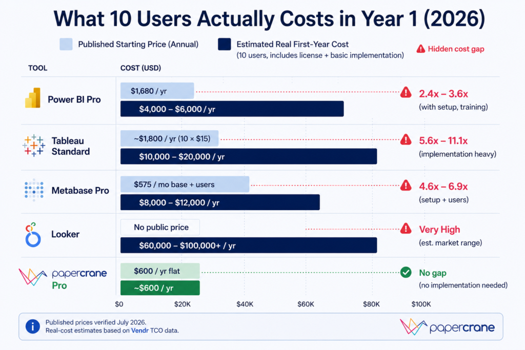
    Small Team: 10 Users, Internal Analytics

    ToolEstimated Annual CostNotes
    Papercrane Pro$600/yearFlat team rate, no per-seat
    Power BI Pro$1,680/year10 × $14/month
    Metabase Starter$1,920/year$100 base + 10 × $6
    Tableau StandardCustom (contact sales for exact mix)$15/user/month starting point; actual depends on user role mix
    LookerContact salesNo published pricing

    Mid-Market: 50 Users, Mix of Roles, Internal Analytics

    ToolLicense Cost/YearWith TCO (1.5-2.5×)
    Power BI Pro$8,400/year$12,600–$21,000
    TableauContact sales for exact quoteSignificantly higher with implementation
    LookerContact salesNo published benchmark

    Vendr’s procurement data shows BI total cost of ownership consistently runs 1.5–2.5× the annual license fee when implementation, infrastructure, and administration are included.

    SaaS Builder: 500 Customers, Embedded Analytics with White-Label

    ToolAnnual CostNotes
    Metabase Pro$78,600/year$575 base + 500 × $12/month viewer fees
    Power BI EmbeddedContact sales (Fabric F SKU)Engineering costs add $150K–$300K
    Looker EmbedContact salesNo public pricing
    Draxlr$900/yearFlat rate, unlimited viewers, white-label included

    What looks like a manageable license turns into a per-viewer fee compounding machine as your customer base grows.

    Traditional BI vs. AI Dashboard Builders: The Pricing Model Shift

    Traditional BI pricing was designed for a world where SQL expertise was rare and dashboards were precious deliverables. That’s why it charged per seat, demanded annual commitments, and gated AI behind the most expensive tier.

    AI-native dashboard builders were designed for a different assumption: any team member should be able to ask a question and get a dashboard in minutes. The pricing models reflect that.

    With tools like Papercrane, you connect your data sources once, BigQuery, Snowflake, PostgreSQL, MongoDB, spreadsheets, GA4, and 50+ more.

    No SQL. No data modeling project. No $150,000 implementation. See how AI dashboard builders work without SQL →

    The pricing difference is structural, not just numerical:

    • Traditional BI: charges per licensed seat, whether used or not. Industry research (BARC/Eckerson Group) shows only around 25% of employees actively use the BI tools their companies pay for, meaning 75% of per-seat costs are often wasted
    • AI dashboard builders: flat team pricing or usage-based credits, you pay for dashboards built, not seats provisioned

    Papercrane’s pricing reflects this: free to start with no credit card required, Pro at $50/month flat for small teams with no per-viewer fees.

    Share dashboards with anyone, no Papercrane account required, no viewer license to purchase. See the full pricing breakdown →

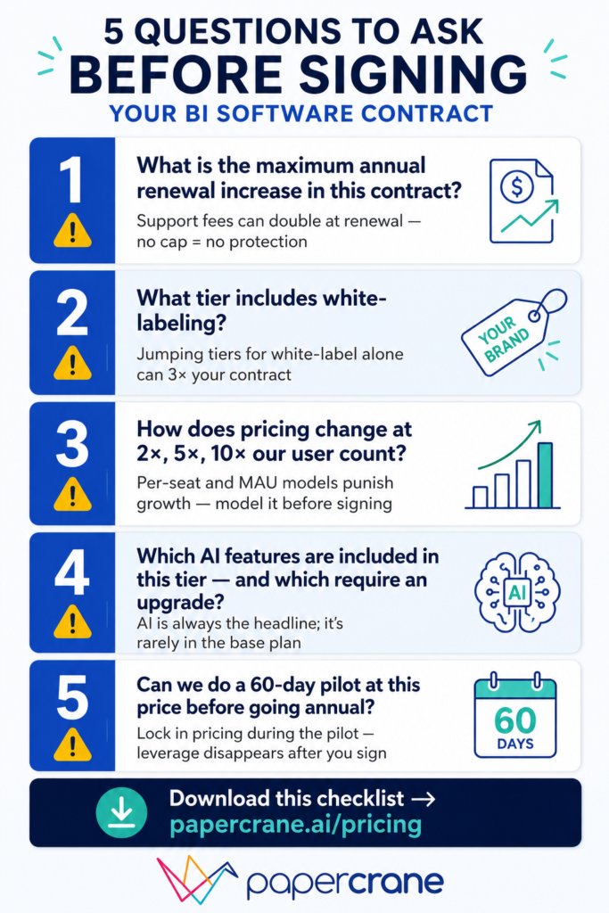
    5 Questions to Ask Every BI Vendor Before Signing

    No competitor covers negotiation tactics. These five questions will save you from the most common contract surprises:

    1. “What is the maximum annual renewal increase in this contract?” If there’s no cap, support and license fees can increase sharply. Ask for a capped percentage in writing.
    2. “What tier includes white-labeling?” Get the answer before evaluating any other feature, especially for embedded use cases.
    3. “How does pricing change when we reach 2×, 5×, 10× our current user count?” Per-seat and MAU-based models penalize growth. Model it before you sign.
    4. “Which AI features are included in this tier, and which require an upgrade?” Every vendor will claim they have AI. Ask which plan those features actually live in.
    5. “Can we do a 60-day pilot at this price before committing to annual?” Most enterprise vendors will agree. Lock in the pricing during the pilot before scaling.

    FAQs

    How much does business intelligence software cost in 2026?

    Business intelligence software ranges from free open-source tools to enterprise platforms costing hundreds of thousands annually. Pricing typically starts around $14/user/month, but total ownership costs often exceed licence fees.

    Why did Power BI pricing increase in 2025?

    Microsoft increased Power BI Pro pricing from $10 to $14 per user/month in April 2025, with Premium Per User rising to $24/month. It was the platform’s first pricing update since 2015.

    What is embedded analytics pricing in 2026?

    Embedded analytics pricing varies by platform. Many charge per interactive viewer, while flat-rate and AI-native solutions offer predictable pricing without viewer fees. Always confirm whether white-labeling is included.

    Is there a dashboard tool without viewer licensing fees?

    Yes. AI-native dashboard builders like PaperCrane and flat-rate platforms such as Draxlr don’t charge per-viewer licensing fees, making them more cost-effective for embedded analytics at scale.

    What is the total cost of ownership for a BI implementation?

    BI implementation costs extend beyond software licences. According to Vendr, total cost of ownership is typically 1.5–2.5× annual licensing after implementation, infrastructure, training, and ongoing administration are included.

    Build Smarter Dashboards with PaperCrane

    Dashboard software pricing in 2026 is not what the pricing page says it is.

    For teams evaluating traditional BI tools: go in knowing the TCO formula, ask the five questions above before signing, and always model what costs look like at 2× and 5× your current user count.

    For teams questioning whether the traditional BI model makes sense at all: the AI-native alternatives have matured enough in 2026 that the comparison is worth making honestly.

    Flat pricing, no viewer fees, no SQL required, and no six-figure implementation project is a meaningfully different value proposition.

    Papercrane’s pricing page takes two minutes to read. Free to start, no credit card, no sales call required.