Blog

  • White Label Dashboard for Agencies: Stop Rebuilding Client Reports

    White Label Dashboard for Agencies: Stop Rebuilding Client Reports

    The client work is done. The reporting work shouldn’t take another few hours.

    Your team pulls Google Ads data, checks GA4, exports CRM numbers, updates charts, applies agency branding, writes the summary, and sends the report. Then the next client needs a different set of metrics.

    As your client list grows, reporting becomes another production workload.

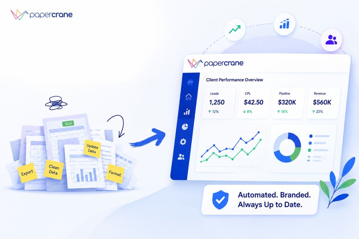
    A better white label dashboard should support automated client reporting, reduce the work behind each account, and give clients a professional, branded way to access their data.

    What Should You Expect From a White Label Dashboard?

    A white label dashboard is a client-facing reporting dashboard presented under your agency’s branding rather than the software provider’s branding.

    For an agency, white labeling should cover more than a logo. The reporting system should support:

    • Your agency branding
    • Custom domains
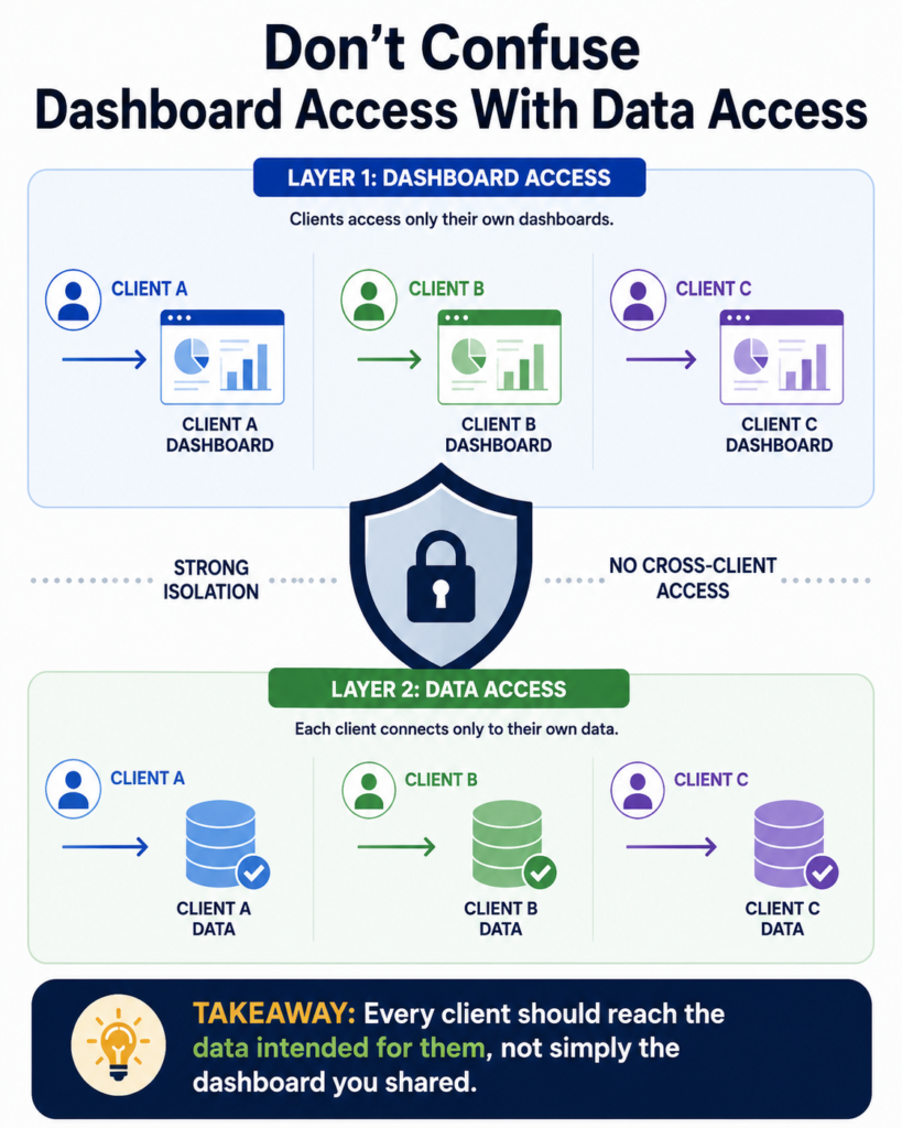
    • Client-specific access
    • Multiple data sources
    • Automated data refreshes
    • Reusable dashboard structures
    • Secure sharing
    • Flexible reporting requirements

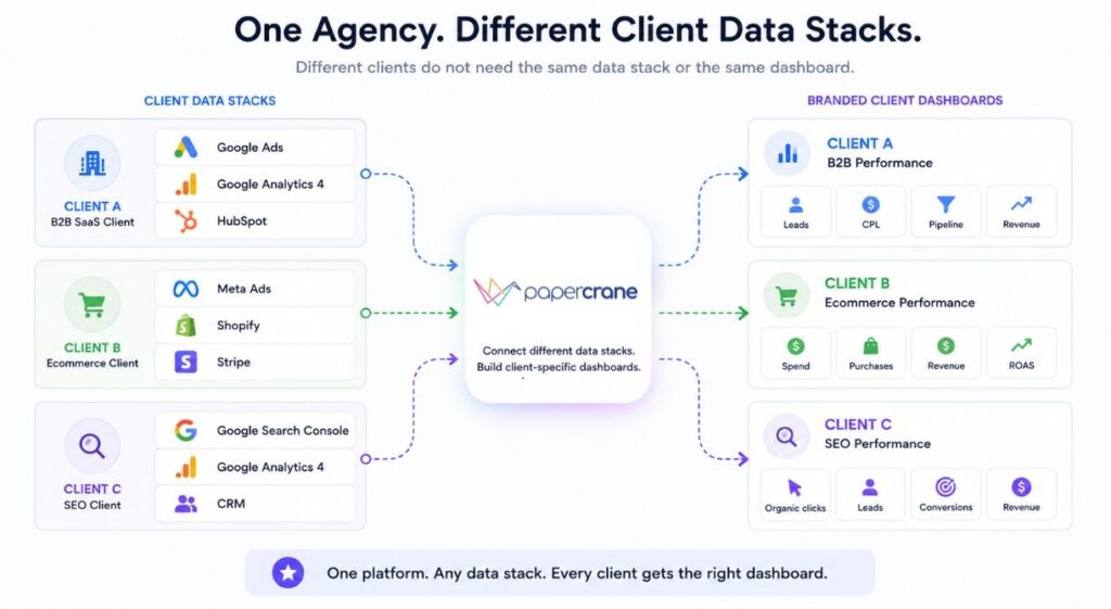
    Consider an agency managing three accounts:

    ClientData sourcesMain KPIs
    B2B SaaSGoogle Ads, GA4, HubSpotLeads, CPL, pipeline, ROAS
    EcommerceMeta Ads, Shopify, StripeRevenue, purchases, ROAS
    SEOSearch Console, GA4, CRMOrganic traffic, leads, revenue

    Good client dashboard software lets the agency present each account under its own brand without forcing every client into the same reporting structure.

    The key distinction is simple. White labeling solves the client-facing experience. The reporting platform behind it still needs to reduce the work required to create and maintain those dashboards.

    Where Most Agency Reporting Tools Stop Short

    A reporting template works well until the client asks for something outside the template.

    A PPC client might need:

    • Spend
    • CPC
    • CPL
    • Conversion rate
    • ROAS

    An SEO client needs a different set:

    • Organic clicks
    • Impressions
    • Rankings
    • Organic conversions
    • Revenue

    Then a client adds a CRM and asks:

    “Can you show pipeline revenue by campaign?”

    Now the reporting workflow needs another change.

    The same issue appears when agencies work across different platforms. One client uses Google Ads and HubSpot. Another uses Meta and Shopify. Another has a PostgreSQL database containing its core revenue data.

    The challenge becomes less about creating a report and more about adapting the reporting system to each client’s business.

    Why Papercrane Fits Agencies With Different Client Data

    Agencies rarely work with one standard data stack.

    A B2B lead generation agency might connect:

    Google Ads + GA4 + HubSpot

    Its dashboard might show:

    • Ad spend
    • Leads
    • Qualified leads
    • CPL
    • Pipeline
    • Revenue

    An ecommerce agency might connect:

    Google Ads + Meta Ads + Shopify + Stripe

    Its dashboard might focus on:

    • Ad spend
    • Purchases
    • Revenue
    • ROAS
    • Average order value
    • Customer revenue

    An SEO agency might combine:

    Search Console + GA4 + CRM

    Its reporting could focus on:

    • Organic clicks
    • Organic sessions
    • Target queries
    • Leads
    • Revenue

    Papercrane supports 100+ data connectors and also supports building your own integrations.

    The value isn’t the number of connectors alone. It is the ability to build reporting around the client’s actual data instead of forcing every account into one template.

    See Papercrane’s integrations and dashboard platform

    Build the Dashboard Around the Client, Not the Template

    This is where AI changes the reporting workflow.

    Instead of starting with a fixed dashboard and modifying every component manually, your team describes what the client needs.

    For example, an agency connects Google Ads and HubSpot and asks:

    “Create a client dashboard showing monthly ad spend, leads, cost per qualified lead, pipeline generated, and ROAS. Compare the last 90 days with the previous period.”

    Then the agency can refine the request:

    “Add campaign-level performance and highlight campaigns with falling conversion rates.”

    Then:

    “Add a summary of the three biggest changes this month.”

    Papercrane handles data modelling, queries, and visualisation from plain-language requests, so your team doesn’t need SQL knowledge to create the dashboard.

    This changes the workflow from building every report component manually to describing the reporting outcome you need.

    To read example of a channel-specific dashboard, see our Google Ads Dashboard guide.

    Give Clients a Branded Reporting Experience

    The dashboard itself is only part of the client experience.

    Your agency also needs control over how clients access and interact with reporting.

    Papercrane’s Pro plan includes custom domains and removal of Papercrane branding. Enterprise adds features such as unlimited dashboards and team members, SSO, embedded analytics, and per-tenant isolation.

    This matters when reporting becomes part of your agency’s service.

    For example, instead of sending a client to a third-party reporting environment, your agency can provide a branded reporting portal under your own domain.

    The client sees the agency’s reporting environment, while your team manages the underlying dashboards and data connections.

    For agencies selling ongoing analytics or reporting services, this creates a more consistent experience from onboarding through monthly performance reviews.

    What Happens When a Client Asks for Something New?

    This is where reporting workflows often become expensive.

    A client asks:

    “Can you add pipeline revenue by Google Ads campaign?”

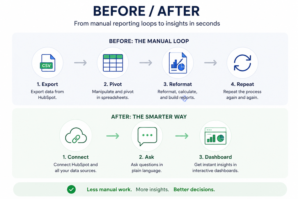
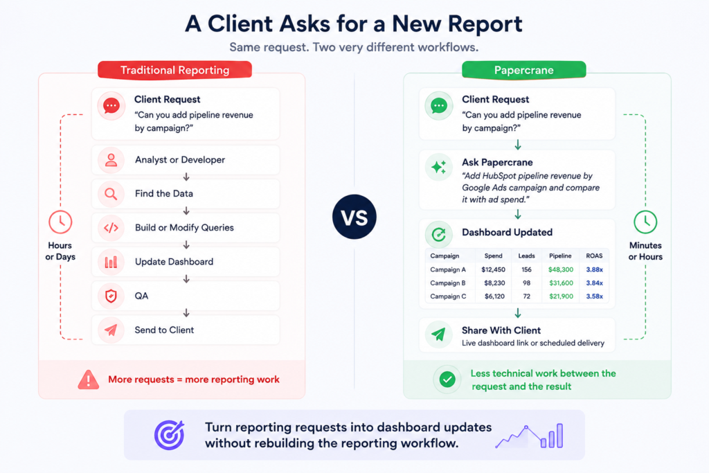
    A traditional workflow might look like:

    Client request → Analyst → Data extraction → Dashboard modification → QA → Client

    Another request arrives:

    “Can we compare this quarter with last year?”

    The process starts again.

    With an AI dashboard workflow, the agency can ask for the new view directly:

    “Add HubSpot pipeline revenue by Google Ads campaign and compare it with advertising spend.”

    The reporting system handles the technical work while the agency decides what the client should see and why it matters.

    The point isn’t to remove your agency’s expertise. It is to reduce the technical work required to turn a reporting request into a useful dashboard.

    Traditional:

    Request → Analyst → Data work → Dashboard update → QA → Client

    Papercrane:

    Request → Ask → Dashboard update → Client

    This visual directly addresses a major agency concern, reporting turnaround time.

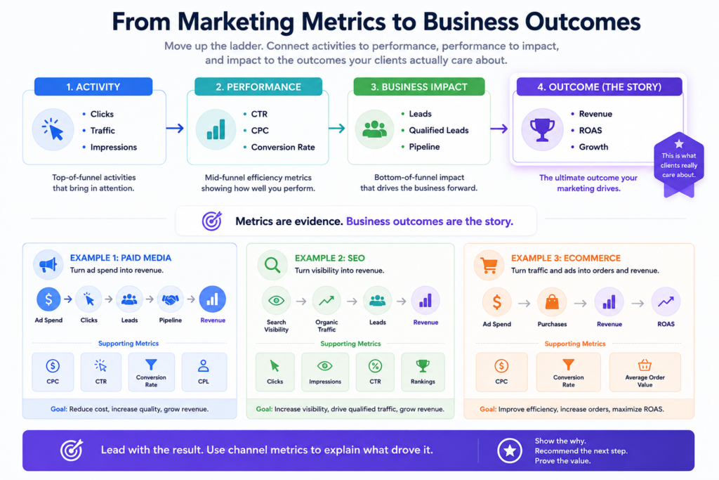
    Build Client Dashboards Around Business Outcomes

    A client doesn’t need 40 charts. They need answers.

    For paid media, don’t lead with impressions and clicks if the client’s goal is lead generation.

    Lead with:

    Leads → Qualified leads → CPL → Pipeline → Revenue

    Then use supporting metrics such as:

    • Impressions
    • Clicks
    • CPC
    • Conversion rate

    For SEO, the primary story might be:

    Organic traffic → Leads → Qualified leads → Revenue

    Search Console performance data provides metrics such as clicks, impressions, CTR, and average position, which agencies can use as supporting evidence for SEO performance.

    For ecommerce:

    Ad spend → Purchases → Revenue → ROAS

    Then show:

    • CPC
    • CTR
    • Conversion rate
    • Average order value

    Google Analytics reports also help to investigating traffic, users, and website or app activity.

    The dashboard becomes more useful when it follows a clear sequence:

    Business outcome → Performance driver → Channel detail → Next action

    Example:

    Clicks → Leads → Qualified Leads → Pipeline → Revenue

    and

    Ad Spend → Conversions → ROAS

    White Label Dashboard vs PDF Client Report

    A white label dashboard and a PDF report serve different purposes.

    White Label DashboardPDF Report
    Live dataFixed snapshot
    Ongoing accessScheduled delivery
    InteractiveStatic
    Client can exploreLimited exploration
    Data refreshes automaticallyNeeds regeneration
    Useful between meetingsUseful for formal summaries

    For example, a monthly PDF might tell a client:

    “Google Ads generated 184 leads in July.”

    A live dashboard lets the client answer follow-up questions:

    • Which campaigns generated those leads?
    • How did CPL change?
    • How did July compare with June?
    • Which campaigns generated pipeline?
    • What happened after budget changes?

    A PDF still has value for formal monthly or quarterly communication. A dashboard becomes more useful when clients need access between meetings.

    When Papercrane Is Right for Your Agency

    You should go for Papercrane if your agency:

    • Manages clients across different data platforms
    • Builds custom dashboards for different accounts
    • Spends significant time modifying reports
    • Relies on spreadsheets or manual exports
    • Wants branded client-facing dashboards
    • Combines marketing data with CRM, ecommerce, finance, or database data
    • Wants teams to create dashboards without waiting for developers or analysts

    For example, an agency with 30 clients might have Google Ads and GA4 for one account, Meta and Shopify for another, and Search Console, GA4, and a CRM for a third.

    A flexible reporting system becomes more valuable as these combinations grow.

    If every client uses the same three metrics and the same reporting format, a template-based reporting platform might meet your needs more efficiently.

    The decision comes down to how much variation exists across your client accounts and how much work your team spends supporting it.

    What Does Papercrane Cost for an Agency?

    Papercrane has three plans.

    Free: Up to 5 dashboards, one user, 100+ connectors, custom integrations, and shareable public links.

    Pro: $50 per month, up to 20 dashboards, up to 5 team members, custom domains, and removal of Papercrane branding.

    Enterprise: Custom pricing, with unlimited dashboards and team members, SSO, private network connectivity, embedded analytics, per-tenant isolation, and additional enterprise controls.

    AI usage is billed through credits. Papercrane states that a dashboard typically costs around $0.30 to $0.60 to generate, with smaller updates costing less.

    See Papercrane pricing

    Stop Rebuilding Client Reports

    Your next client shouldn’t require another reporting workflow from scratch.

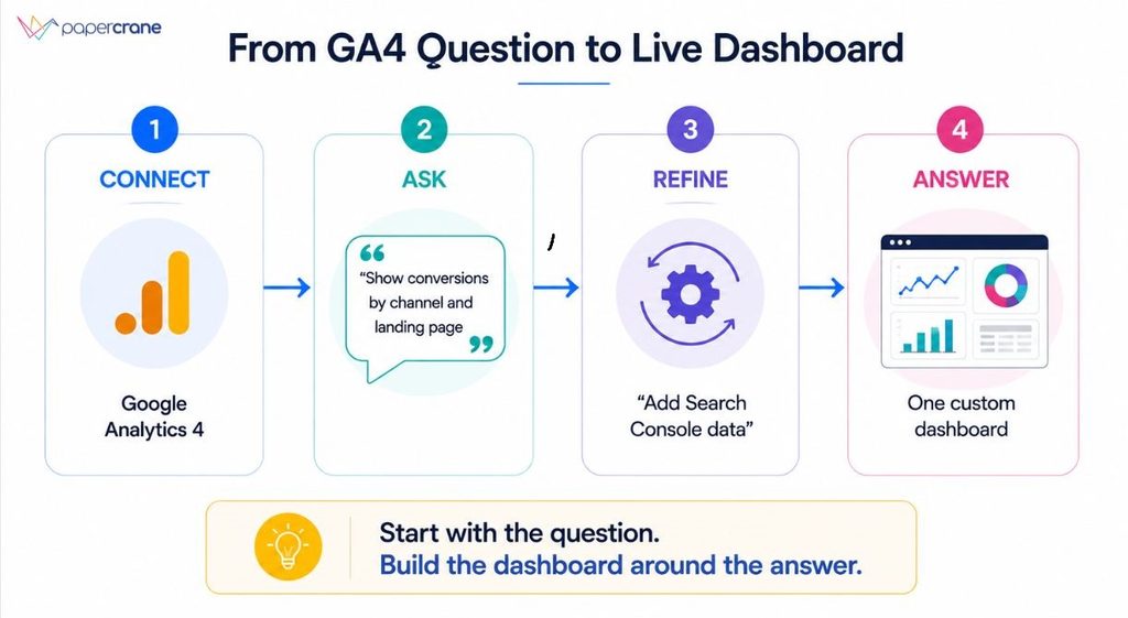
    Connect the client’s data sources. Ask for the dashboard you need. Refine it as requirements change. Apply your agency’s branding. Share it with the client.

    The result is a reporting process built around the agency’s workflow rather than another collection of fixed templates.

    If your team spends too much time assembling, modifying, and maintaining client reports, Papercrane gives you a different approach.

    See how Papercrane works for agencies

    FAQs

    Is Papercrane a white label dashboard platform?

    Yes. Papercrane’s Pro plan includes custom domains and removal of Papercrane branding. Enterprise adds customer-facing embedded analytics and per-tenant isolation.

    How does Papercrane handle different client data sources?

    Papercrane supports 100+ data connectors and allows teams to build their own integrations.

    Do I need SQL to build Papercrane dashboards?

    No. Papercrane states that users describe what they want to see in plain language while its AI handles data modelling, queries, and visualisation.

    Can agencies create different dashboards for each client?

    Yes. Each dashboard can be built around the client’s data sources, KPIs, reporting requirements, and access needs.

    Does Papercrane support custom domains?

    Custom domains are included in the Pro and Enterprise plans.

    Is Papercrane suitable for every agency?

    It fits agencies with varied client data, custom reporting requirements, and recurring dashboard work. Agencies with identical reporting requirements across every client might prefer a simpler template-based reporting workflow.

  • SaaS Dashboard: Track MRR, Churn and Cohorts Without an Analyst

    SaaS Dashboard: Track MRR, Churn and Cohorts Without an Analyst

    A SaaS metrics dashboard is a single view of your most important numbers, MRR, churn, retention, and cohorts.

    It replaces spreadsheets, CSV exports, and one-off reports. Most founders don’t have one. They have pieces of one, scattered across different tools.

    Where Your Numbers Actually Live Right Now

    Your revenue data sits in Stripe. Your churn reasons live in a support tool, or in nobody’s memory at all. Your cohort data is buried in a database only your engineer can query.

    Every Monday, someone stitches these together by hand. Usually it’s the founder. Sometimes it’s whoever’s turn it is to build the investor update.

    This isn’t a tooling problem. It’s a visibility problem. Your metrics exist. They’re just not talking to each other.

    Common places metrics get stuck:

    • MRR and revenue data in Stripe or your billing system
    • Churn reasons in support tickets or exit surveys
    • Cohort and signup data in your product database
    • Everything else in a spreadsheet someone updates by hand

    What It Actually Costs You

    When your metrics live in five places, you don’t see problems until they’re big. A churn spike shows up a month late, after it’s already hurt revenue.

    Board updates take a full day to prepare instead of five minutes. Retention issues look like random noise instead of a clear pattern, because nobody has time to break them down by cohort.

    None of this is a data problem. It’s a dashboard problem. Once your numbers are in one place, the pattern is usually obvious.

    What a Real SaaS Metrics Dashboard Should Show

    A dashboard isn’t useful just because it has charts. It’s useful because it answers real questions fast. Here’s what actually belongs on one.

    MRR: The Number Everything Else Builds On

    Monthly recurring revenue is your baseline. But the total number alone hides what’s happening underneath it.

    A good MRR dashboard breaks revenue into four parts:

    • New MRR from new customers
    • Expansion MRR from upgrades
    • Contraction MRR from downgrades
    • Churned MRR from cancellations

    This is often shown as a waterfall chart. It shows exactly why MRR moved, not just that it moved.

    Churn: Gross vs. Net

    A churn dashboard should never show one churn number. It should show two.

    Gross churn is revenue lost from cancellations and downgrades. Net churn subtracts any expansion revenue from that loss. You can have high gross churn and still grow, if expansion is strong enough to cover it.

    Investors read net churn first. It tells them whether your existing customers are funding your growth or draining it.

    A customer retention dashboard tracks this over time, not just as a single monthly snapshot. Trends matter more than any one number.

    Cohort Analysis: Where the Real Story Hides

    Blended churn hides problems. A cohort analysis dashboard doesn’t.

    It groups customers by the month they signed up, then tracks how many are still active each month after. This shows whether retention is improving or getting worse for newer customers, even if your overall churn number looks stable.

    If cohort three months ago retains worse than cohort six months ago, something changed. A blended number would never show you that.

    How Papercrane Solves This

    Papercrane is an AI dashboard builder that connects your data and builds this dashboard for you. No SQL, no analyst, no spreadsheet stitched together by hand.

    You connect Stripe, your CRM, or your product database. You describe what you want in plain English: “show me MRR by component” or “show me cohort retention for the last six months.” Papercrane builds the chart.

    This works the same way our team built an AI dashboard builder without SQL for broader business reporting. The same approach applies directly to SaaS metrics, just with MRR, churn, and cohorts as the focus instead of general analytics.

    What the Process Actually Looks Like

    Getting your dashboard live takes three steps.

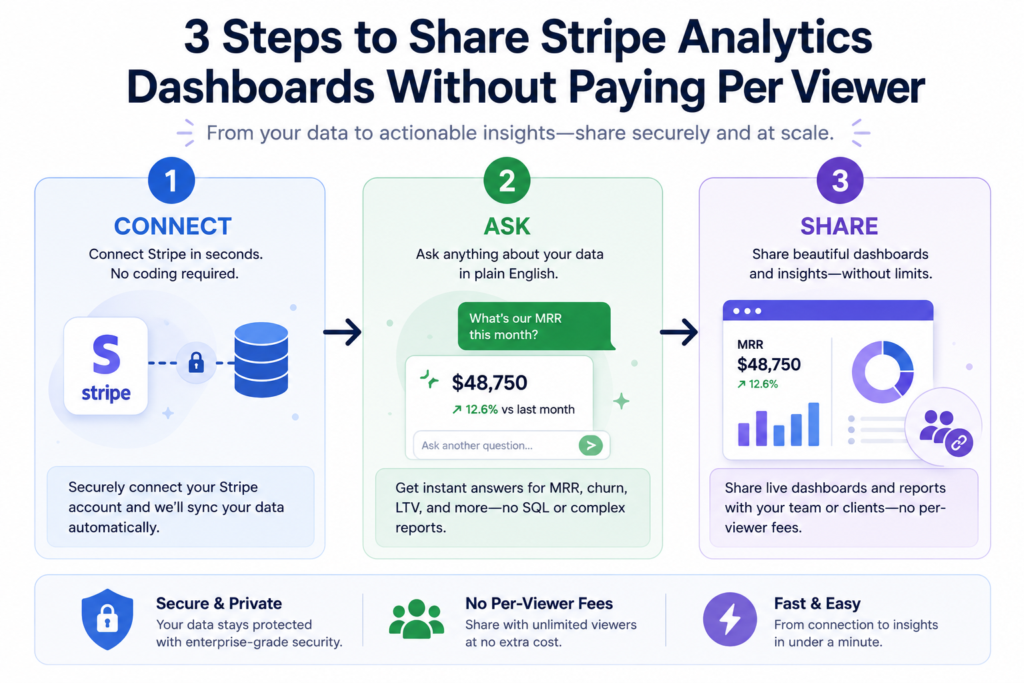
    1. Connect your data. Link Stripe, your CRM, or your database in a few clicks.
    2. Ask for what you want. Type a plain-English request instead of writing a query.
    3. Get your dashboard. MRR, churn, and cohort views populate automatically.

    No engineer required. No waiting on an analyst’s queue. Most teams have a working dashboard within minutes of connecting their data.

    See Your Metrics in One Place

    Stop rebuilding the same report every month. Connect your data, ask Papercrane what you want to see, and get live MRR, churn, and cohort SaaS dashboards in minutes.

    Try Papercrane free and see your first dashboard populate today.

    Frequently Asked Questions

    What metrics should a SaaS dashboard track?

    At minimum: MRR and its components, gross and net churn, retention rate, and cohort analysis. These four give you a full picture of revenue health.

    How is this different from a churn dashboard alone?

    A churn dashboard shows one piece of the story. A full SaaS metrics dashboard connects churn to revenue and cohorts, so you can see why churn is happening, not just that it is.

    Do I need an analyst to set this up?

    No. Tools like Papercrane connect directly to your data sources and build the dashboard from a plain-English request. No SQL or technical setup required.

  • Dashboard Software Pricing 2026: Hidden Costs Exposed

    Dashboard Software Pricing 2026: Hidden Costs Exposed

    A CFO signed a Tableau contract. The plan looked reasonable, a manageable per-user number.

    Six months in, between implementation consulting, data prep, training, and the support tier he didn’t know was optional, his team had spent well over what the license alone implied.

    Seventy-five percent of his employees still used Excel.

    That story isn’t an outlier. It’s the standard arc for business intelligence pricing in 2026.

    The gap between what dashboard software says it costs and what it actually costs is one of the most consistently underestimated line items in a modern tech budget.

    Why BI Pricing Is So Hard to Decode in 2026

    You’re no longer choosing between “cheap” and “expensive”, you’re navigating six incompatible models: per-seat, per-capacity, MAU-based, consumption credits, flat-rate, and hybrid.

    A tool that looks affordable on the pricing page can cost 3x more once you factor in viewers, white-labeling, and AI add-ons.

    Two events in 2025 made this worse. First, Microsoft raised Power BI Pro from $10 to $14 per user per month, a 40% hike applied to existing customers at renewal, with minimal warning.

    Second, AI features became the headline marketing claim for every BI vendor, but almost universally those features are gated behind premium tiers that cost multiples of the base plan.

    The median cheapest monthly BI plan across the market is $49. The average is $379, pulled upward dramatically by a handful of enterprise-first products.

    The 5 Hidden Costs Nobody Puts on Their Pricing Page

    1. Viewer and User License Fees

    Most platforms charge depending on what users do, build dashboards vs. view them vs. explore data. The split sounds reasonable until you model it for a real team.

    For embedded analytics, dashboards inside your own SaaS product for customers, the problem is sharper.

    Metabase Pro (verified July 2026) charges $575/month base plus $12/month per interactive viewer.

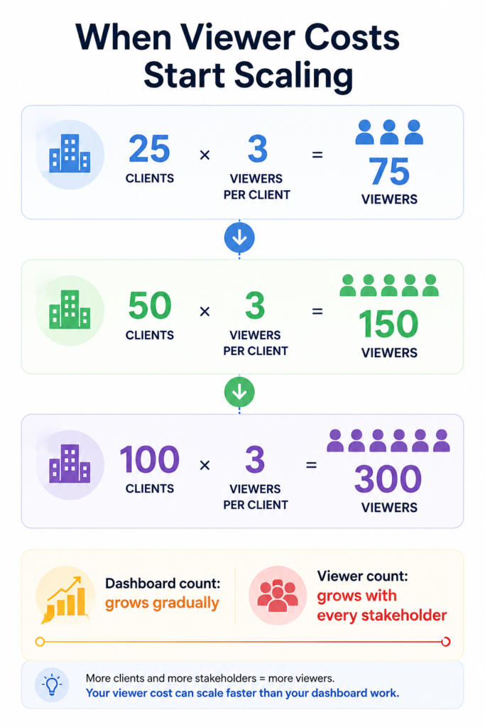
    Five hundred customers viewing your embedded dashboard means $6,000/month in viewer fees on top of the base plan, $78,600/year before a single implementation dollar is spent.

    The rule: always model the cost at your current user count and at 2x and 5x that count before signing.

    2. White-Label Fees

    If you need to embed dashboards in your product without another company’s logo on it, you need white-labeling. Almost every vendor offers it, at a much higher tier than their entry price.

    Always ask “what tier includes white-labeling?” before evaluating any other feature, especially for customer-facing use cases. Jumping tiers for white-label access alone commonly doubles or triples the contract value.

    3. Implementation Costs

    Vendors rarely mention this, but Vendr’s procurement data across BI platforms consistently shows total cost of ownership runs 1.5 to 2.5x the annual license fee when you include implementation, infrastructure setup, training, and ongoing administration.

    For embedded analytics platforms specifically, engineering infrastructure, multi-tenancy, row-level security, and governance, commonly adds $150,000 to $300,000 in first-year costs that never appear on the pricing page.

    Forrester’s research estimates up to 80% of IT budget gets consumed by maintenance costs after the initial build, leaving only 20% for new capability.

    The 29% of teams who built in-house analytics regretted it within one year. The math explains why.

    4. AI Features That Require a Full Tier Upgrade

    Every BI vendor’s homepage leads with AI in 2026. Almost none include meaningful AI in their base plan.

    • Power BI Copilot: Requires Fabric capacity, not available on the $14/user Pro plan. The entry-level Fabric F64 tier that eliminates per-user viewer licenses costs approximately $8,410/month pay-as-you-go or $4,982/month on a 1-year reservation (verified July 2026, US region)
    • Tableau Agent and Pulse: Included from Standard tier, but agentic capabilities (Tableau Next) require the Tableau+ Bundle, contact sales only.
    • Metabase Metabot AI: Add-on at $100/month for 500 requests, not included in base plans

    The pattern is consistent: AI is the headline feature, but the useful version is always further up the pricing ladder.

    5. Renewal Increases and Multi-Year Lock-In

    Tableau requires annual contracts, no month-to-month option exists. Documented cases show support fees jumping significantly at renewal, and there is no standard renewal cap in base agreements.

    Power BI pricing comparison in April 2025 was applied to existing contracts at renewal. Domo customers have reported renewal increases in the hundreds of percent.

    These aren’t edge cases, they’re standard commercial behavior from large BI vendors operating in a market where switching costs are high.

    Business Intelligence Pricing by Tool

    Microsoft Power BI

    PlanMonthly Cost
    DesktopFree (Windows only)
    Pro$14/user/month (raised 40% from $10 in April 2025)
    Premium Per User (PPU)$24/user/month
    Fabric F64 (pay-as-you-go)$8,410/month (eliminates viewer licenses at this tier and above)
    Fabric F64 (1-year reserved)$4,982/month (41% savings vs. pay-as-you-go)

    Source: Microsoft Power BI official blog (November 2024), Solv Systems Fabric pricing guide (July 2026)

    Reality check: Power BI Pro looks affordable at $14/user/month until you need AI features (Fabric), white-labeling (Fabric), or to eliminate viewer licensing at scale (requires F64 or above).

    The $14/user plan is a reporting tool, not a full analytics platform pricing.

    Best for: Microsoft-stack organizations (M365, Azure, Dynamics) with dedicated BI talent who don’t need embedded analytics.

    Tableau

    PlanStarting PriceNotes
    Tableau Standard (Cloud or Server)$15/user/monthAnnual only; includes Tableau Pulse
    Tableau Enterprise (Cloud or Server)$35/user/monthAnnual only; Advanced Management included
    Tableau Cloud+ / Server+Contact salesIncludes Tableau Agent, Premier Success
    Tableau Next$40/user/monthAgentic analytics; Salesforce CRM integration
    Tableau+ BundleContact salesCloud + Next combined

    Source: tableau.com/pricing, verified July 21, 2026

    Important context: Tableau pricing comparison is restructured now. The $15/user/month Standard price is the published entry point, actual costs depend on user mix (Creator, Explorer, Viewer roles), deployment type (Cloud vs. Server), and whether you need AI/agentic features. All plans are annual only with no month-to-month option.

    Best for: Enterprise teams where visualization depth and governance are the primary requirements and budget allows for the full implementation investment.

    Looker (Google Cloud)

    Looker publishes no public pricing, all three editions (Standard, Enterprise, Embed) list “Call Sales / Annual commitment” on the official Google Cloud pricing page (verified July 2026).

    Widely cited market estimates put enterprise contracts in the range of $60,000-$300,000/year depending on user count and edition, but these are not verifiable from published sources. Always get a direct quote before budgeting.

    Best for: Organizations deeply invested in Google Cloud / BigQuery with dedicated data engineering teams.

    Metabase

    PlanMonthly CostNotes
    Open SourceFreeSelf-hosted; community support only
    Cloud Starter$100/month + $6/user/month (first 5 included)Basic cloud hosting
    Cloud Pro$575/month + $12/user/month (first 10 included)SSO, white-label, embedded analytics
    EnterpriseFrom $20,000/yearCustom; dedicated support, compliance

    Source: metabase.com/pricing, verified April 2026 across multiple independent sources

    The embedded trap: Every interactive viewer in Metabase Pro, including your customers accessing embedded dashboards, counts as a paid seat at $12/month. There is no separate cheaper viewer tier. For SaaS teams with hundreds of customers, this compounds fast.

    Internal BI vs. Embedded Analytics: Two Very Different Pricing Worlds

    This distinction trips up more buyers than any other. Internal BI means dashboards for your own employees. Embedded analytics means dashboards inside your product, visible to your customers.

    The tools and pricing models are fundamentally different:

    • Internal BI (Power BI, Tableau, Looker): priced per internal seat, built for analysts and executives
    • Embedded analytics (Metabase Embedded, Sisense, Draxlr, Papercrane): built for multi-tenancy, white-labeling, and external viewer scale

    The trap: companies start with an internal BI tool pricing comparison because it’s cheaper upfront, then try to embed it for customers, and discover it’s either technically impossible or commercially prohibitive at their tier. Always answer “will my customers ever see this dashboard?” before choosing a tool category.

    Explore the full breakdown of embedded analytics use cases and real-world examples

    Real Cost Scenarios: What 3 Types of Teams Actually Pay

    Small Team: 10 Users, Internal Analytics

    ToolEstimated Annual CostNotes
    Papercrane Pro$600/yearFlat team rate, no per-seat
    Power BI Pro$1,680/year10 × $14/month
    Metabase Starter$1,920/year$100 base + 10 × $6
    Tableau StandardCustom (contact sales for exact mix)$15/user/month starting point; actual depends on user role mix
    LookerContact salesNo published pricing

    Mid-Market: 50 Users, Mix of Roles, Internal Analytics

    ToolLicense Cost/YearWith TCO (1.5-2.5×)
    Power BI Pro$8,400/year$12,600–$21,000
    TableauContact sales for exact quoteSignificantly higher with implementation
    LookerContact salesNo published benchmark

    Vendr’s procurement data shows BI total cost of ownership consistently runs 1.5–2.5× the annual license fee when implementation, infrastructure, and administration are included.

    SaaS Builder: 500 Customers, Embedded Analytics with White-Label

    ToolAnnual CostNotes
    Metabase Pro$78,600/year$575 base + 500 × $12/month viewer fees
    Power BI EmbeddedContact sales (Fabric F SKU)Engineering costs add $150K–$300K
    Looker EmbedContact salesNo public pricing
    Draxlr$900/yearFlat rate, unlimited viewers, white-label included

    What looks like a manageable license turns into a per-viewer fee compounding machine as your customer base grows.

    Traditional BI vs. AI Dashboard Builders: The Pricing Model Shift

    Traditional BI pricing was designed for a world where SQL expertise was rare and dashboards were precious deliverables. That’s why it charged per seat, demanded annual commitments, and gated AI behind the most expensive tier.

    AI-native dashboard builders were designed for a different assumption: any team member should be able to ask a question and get a dashboard in minutes. The pricing models reflect that.

    With tools like Papercrane, you connect your data sources once, BigQuery, Snowflake, PostgreSQL, MongoDB, spreadsheets, GA4, and 50+ more.

    No SQL. No data modeling project. No $150,000 implementation. See how AI dashboard builders work without SQL

    The pricing difference is structural, not just numerical:

    • Traditional BI: charges per licensed seat, whether used or not. Industry research (BARC/Eckerson Group) shows only around 25% of employees actively use the BI tools their companies pay for, meaning 75% of per-seat costs are often wasted
    • AI dashboard builders: flat team pricing or usage-based credits, you pay for dashboards built, not seats provisioned

    Papercrane’s pricing reflects this: free to start with no credit card required, Pro at $50/month flat for small teams with no per-viewer fees.

    Share dashboards with anyone, no Papercrane account required, no viewer license to purchase. See the full pricing breakdown →

    5 Questions to Ask Every BI Vendor Before Signing

    No competitor covers negotiation tactics. These five questions will save you from the most common contract surprises:

    1. “What is the maximum annual renewal increase in this contract?” If there’s no cap, support and license fees can increase sharply. Ask for a capped percentage in writing.
    2. “What tier includes white-labeling?” Get the answer before evaluating any other feature, especially for embedded use cases.
    3. “How does pricing change when we reach 2×, 5×, 10× our current user count?” Per-seat and MAU-based models penalize growth. Model it before you sign.
    4. “Which AI features are included in this tier, and which require an upgrade?” Every vendor will claim they have AI. Ask which plan those features actually live in.
    5. “Can we do a 60-day pilot at this price before committing to annual?” Most enterprise vendors will agree. Lock in the pricing during the pilot before scaling.

    FAQs

    How much does business intelligence software cost in 2026?

    Business intelligence software ranges from free open-source tools to enterprise platforms costing hundreds of thousands annually. Pricing typically starts around $14/user/month, but total ownership costs often exceed licence fees.

    Why did Power BI pricing increase in 2025?

    Microsoft increased Power BI Pro pricing from $10 to $14 per user/month in April 2025, with Premium Per User rising to $24/month. It was the platform’s first pricing update since 2015.

    What is embedded analytics pricing in 2026?

    Embedded analytics pricing varies by platform. Many charge per interactive viewer, while flat-rate and AI-native solutions offer predictable pricing without viewer fees. Always confirm whether white-labeling is included.

    Is there a dashboard tool without viewer licensing fees?

    Yes. AI-native dashboard builders like PaperCrane and flat-rate platforms such as Draxlr don’t charge per-viewer licensing fees, making them more cost-effective for embedded analytics at scale.

    What is the total cost of ownership for a BI implementation?

    BI implementation costs extend beyond software licences. According to Vendr, total cost of ownership is typically 1.5–2.5× annual licensing after implementation, infrastructure, training, and ongoing administration are included.

    Build Smarter Dashboards with PaperCrane

    Dashboard software pricing in 2026 is not what the pricing page says it is.

    For teams evaluating traditional BI tools: go in knowing the TCO formula, ask the five questions above before signing, and always model what costs look like at 2× and 5× your current user count.

    For teams questioning whether the traditional BI model makes sense at all: the AI-native alternatives have matured enough in 2026 that the comparison is worth making honestly.

    Flat pricing, no viewer fees, no SQL required, and no six-figure implementation project is a meaningfully different value proposition.

    Papercrane’s pricing page takes two minutes to read. Free to start, no credit card, no sales call required.

  • How to Build a MongoDB Dashboard Without Aggregation Pipelines

    How to Build a MongoDB Dashboard Without Aggregation Pipelines

    Your MongoDB database has millions of documents. Your stakeholders want a dashboard by Monday. Your developer is in the middle of a sprint.

    And the last time someone tried to build one, they spent three days tangled in aggregation pipelines ($group, $lookup, $unwind), only to end up with a broken chart that nobody understood.

    Sound familiar?

    Fortunately, building a MongoDB dashboard no longer has to rely on complex aggregation pipelines.

    Modern AI-powered tools make it possible to visualize MongoDB data using plain language, helping teams create interactive dashboards faster.

    What Is a MongoDB Dashboard?

    A MongoDB dashboard is a visual interface that connects to a MongoDB database and displays data as charts, graphs, tables, and key performance indicators (KPIs).

    It helps users monitor business metrics, analyse trends, and make data-driven decisions without manually querying the database each time they need insights.

    Why MongoDB Dashboards Rely on Aggregation Pipelines

    An MongoDB aggregation pipeline is MongoDB’s built-in mechanism for processing and transforming data. It works in stages, each stage takes documents in, transforms them, and passes results to the next stage. Common stages include:

    • $match: filter documents (like a WHERE clause)
    • $group: group documents and calculate totals, averages, counts
    • $project: reshape documents, keep or exclude fields
    • $sort: order results
    • $lookup: join data from another collection

    In theory, this is elegant and powerful. In practice, for a product manager trying to build a dashboard showing revenue by month, it looks like this:

    db.orders.aggregate([
      { $match: { status: "completed", createdAt: { $gte: ISODate("2024-01-01") } } },
      { $group: {
          _id: { $dateToString: { format: "%Y-%m", date: "$createdAt" } },
          totalRevenue: { $sum: "$amount" },
          orderCount: { $sum: 1 }
      }},
      { $sort: { "_id": 1 } }
    ])

    That’s the simple version, a single collection, a single metric, no joins. Add a second collection, a conditional calculation, or a nested array, and you’re looking at 20-40 lines of JSON syntax.

    As reporting requirements expand, teams typically face three common challenges.

    Developer Dependency

    Every new dashboard or reporting request often requires developer involvement. Business users can’t easily modify aggregation pipelines, so even minor reporting changes compete with product development priorities.

    Keeping Dashboards Up to Date

    As collections evolve, existing pipelines need updating to reflect new fields, document structures, or business logic. Managing multiple pipelines across dashboards increases maintenance effort and the risk of inconsistent reports.

    Performance Challenges

    Complex pipelines that rely on stages such as $lookup and $group can become resource-intensive on large collections. Without careful optimisation, dashboard queries may take longer to execute, affecting real-time reporting and user experience.

    How to Build a MongoDB Dashboard Without Aggregation Pipelines

    Here’s where things change. AI-powered dashboard builders like PaperCrane. Take a fundamentally different approach to MongoDB dashboard creation. Instead of making you learn query syntax, they let you describe what you want to see and handle the data retrieval automatically.

    No aggregation pipelines. No BI Connector. No ODBC drivers. No developer dependency.

    Here’s how it works, step by step.

    Step 1: Connect Your MongoDB Database

    Connect your MongoDB Atlas or self-hosted database using its connection string (URI). The dashboard builder automatically detects your collections, field types, and document structure, eliminating the need for manual schema configuration.

    Connect your MongoDB database to PaperCrane

    Step 2: Select Your Collections

    Choose the collections you want to analyse, such as orders, users, events, or support tickets. You can combine data across multiple collections without manually creating $lookup stages or aggregation pipelines.

    Step 3: Build With AI Dashboard Builder

    Describe the dashboard you want in plain English, such as “Show monthly revenue” or “Display daily active users.” The AI generates the required query, retrieves the data, and creates a live MongoDB dashboard with the most suitable visualisation.

    Step 4: Customise and Share

    Add charts, KPIs, filters, and tables, then share your MongoDB analytics dashboard with your team or embed it into your applications. Your dashboards stay connected to MongoDB and refresh automatically with the latest data.

    MongoDB Charts Alternative: When to Use Native Tools vs. an AI Dashboard Builder

    Not every team has the same needs. The right MongoDB reporting tool depends on your technical context, your team structure, and what you’re trying to accomplish.

    Here’s a comparison.

    FeatureMongoDB ChartsTableau + BI ConnectorAI Dashboard Builder (PaperCrane)
    Works without Atlas❌ No✅ Yes (with driver)✅ Yes
    Requires aggregation pipelinesPartially❌ Yes (via SQL translation)❌ No
    Non-technical user friendlyModerate❌ No✅ Yes
    Cross-collection joins❌ Limited✅ Yes✅ Yes
    Setup timeMinutes (Atlas only)Hours to daysMinutes
    Preserves nested document structure✅ Yes❌ Flattened✅ Yes
    Real-time data✅ YesDelayed✅ Yes
    Natural language queries❌ No❌ No✅ Yes
    Works on self-hosted MongoDB❌ No✅ Yes✅ Yes

    MongoDB Dashboard Use Cases

    A MongoDB dashboard helps different teams turn operational data into actionable insights. Common use cases include:

    SaaS Product Analytics

    Track daily and monthly active users, feature adoption, onboarding funnels, churn risk, and revenue by subscription plan with a MongoDB analytics dashboard.

    E-commerce Operations

    Monitor order volume, sales performance, inventory, cart abandonment, fulfilment status, and customer trends through real-time MongoDB visualization.

    IoT and Sensor Monitoring

    Visualize time-series data, device health, sensor readings, uptime, and anomaly detection to monitor connected systems at scale.

    Customer Support

    Measure open tickets, response and resolution times, agent performance, escalation rates, and SLA compliance with live dashboards.

    Internal Business Reporting

    Track finance, HR, operations, and project KPIs in one place. Instead of manually querying the database, teams can visualize MongoDB data and access up-to-date reports whenever they need them.

    FAQs

    What is a MongoDB dashboard?

    A MongoDB dashboard displays MongoDB data as charts, tables, KPIs, and graphs, helping teams monitor performance and make faster decisions.

    Can you build a MongoDB dashboard without writing code?

    Yes. AI-powered tools let you build a MongoDB dashboard using plain English instead of aggregation pipelines, SQL, or custom code.

    What is the best MongoDB dashboard tool for non-technical users?

    AI-powered dashboard builders are the easiest option because they automatically visualize MongoDB data without requiring query or BI expertise.

    Can Tableau or Power BI connect to MongoDB?

    Yes. Both connect through the MongoDB BI Connector, but setup, schema translation, and ongoing maintenance add complexity.

    What is the difference between MongoDB Charts and the BI Connector?

    MongoDB Charts is a native visualisation tool, while the BI Connector translates MongoDB data for SQL-based BI platforms like Tableau and Power BI.

    What are the limitations of MongoDB Charts?

    MongoDB Charts supports Atlas only, offers limited customisation, and lacks natural language queries and advanced cross-collection reporting.

    Is MongoDB Charts free?

    MongoDB Charts is included with MongoDB Atlas but isn’t available for self-hosted MongoDB deployments. Atlas usage costs still apply.

    Build Smarter MongoDB Dashboards with PaperCrane

    MongoDB is excellent for storing document-based data, but turning that data into business insights often requires complex reporting workflows.

    Instead of relying on aggregation pipelines, BI connectors, or manual exports, PaperCrane lets you connect your database and create a live MongoDB dashboard using natural language.

    If your team also stores data in PostgreSQL alongside MongoDB, you might find our guide on building a PostgreSQL dashboard equally useful.

  • PostgreSQL Dashboard in Minutes: No SQL Required

    PostgreSQL Dashboard in Minutes: No SQL Required

    If your business stores data in PostgreSQL, you’re already sitting on valuable insights. The challenge is turning that data into reports your team can actually use.

    A PostgreSQL dashboard solves this by transforming raw database records into interactive charts, reports, and KPIs that help teams monitor performance in real time.

    Modern AI-powered dashboard builders take this a step further by allowing you to generate dashboards without writing SQL, making PostgreSQL reporting faster and more accessible for technical and non-technical users alike.

    What Is a PostgreSQL Dashboard?

    A PostgreSQL dashboard is a visual interface that transforms data stored in a PostgreSQL database into interactive charts, graphs, tables, and key performance indicators (KPIs).

    Data stored in PostgreSQL can be queried, analysed, and visualised using reporting tools, as described in the official PostgreSQL documentation.

    Traditionally, building dashboard for PostgreSQL involved connecting your database to a business intelligence (BI) tool, writing SQL queries, and manually creating visualisations.

    Today, AI-powered dashboard builders simplify the process by allowing users to connect their PostgreSQL database, ask questions in plain English, and generate interactive dashboards without writing SQL.

    This makes PostgreSQL analytics and reporting more accessible to business teams while reducing reliance on developers and data analysts.

    Why PostgreSQL Reporting Becomes a Bottleneck

    PostgreSQL is highly reliable for storing and managing structured business data. However, as databases grow and reporting requirements become more complex, creating dashboards and reports often requires significant manual effort.

    Common challenges include:

    • SQL dependency: Every new report or dashboard often requires writing or modifying SQL queries.
    • Multiple tools: Building a PostgreSQL dashboard means switching between PostgreSQL, BI platforms, and visualisation tools.
    • Delayed reporting: Business users frequently rely on developers or data analysts to create or update reports.
    • Manual dashboard maintenance: As metrics and business requirements change, dashboards need continuous updates.
    • Slower decision-making: Waiting for reports can delay important business decisions and reduce productivity.

    Expert Tip:
    Before building a dashboard, define the business questions you want to answer first. Dashboards built around a small set of meaningful KPIs are easier to maintain and more valuable than dashboards filled with unnecessary charts.

    AI-powered tools simplify PostgreSQL visualization by automatically creating charts and dashboards from natural language questions.

    Build PostgreSQL Dashboards Without Writing SQL

    Rather than building every report from scratch, AI dashboard builders understand your database structure and translate natural language into the queries needed to retrieve the right data.

    For example, instead of writing SQL, you can ask questions like:

    • Show monthly revenue by region.
    • Compare sales performance for the last 12 months.
    • Which products generated the highest profit this quarter?
    • Display customer growth by month.

    The AI automatically retrieves the relevant data and presents it as charts, KPIs, and reports, making PostgreSQL data visualization faster and easier for everyone.

    Focus on Insights, Not SQL

    The purpose of a PostgreSQL dashboard is to help teams make quick accurate decisions.

    AI-powered dashboards reduce manual work by automating data retrieval, visualisation, and reporting, allowing teams to focus on analysing trends instead of building dashboards.

    PostgreSQL Dashboard vs Traditional Reporting Tools

    Choosing the right reporting solution depends on your team’s technical skills, reporting needs, and how quickly you need insights.

    Traditional Reporting ToolsAI Dashboard Builder
    SQL queries requiredAsk questions in plain English
    Manual dashboard creationAI generates dashboards automatically
    Multiple reporting toolsOne unified workspace
    Technical expertise neededSuitable for technical and non-technical users
    Hours to build reportsInteractive dashboards in minutes

    Popular PostgreSQL reporting tools such as Grafana, Metabase, Tableau, Power BI, and Apache Superset are excellent options for data visualisation and business reporting.

    However, they often require users to understand database structures, write SQL queries, or manually configure dashboards before meaningful insights can be generated.

    AI dashboard builders reduce these steps by allowing users to interact with PostgreSQL data using natural language, making reporting faster and more accessible across the organisation.

    PostgreSQL Dashboard vs Static Reports

    While the choice of reporting tool affects how dashboards are built, it’s also important to understand why businesses increasingly prefer interactive dashboards over traditional static reports.

    PostgreSQL DashboardStatic Reports
    InteractiveFixed
    Real-time insightsHistorical snapshots
    FilterableLimited filtering
    Live KPIsStatic metrics
    Supports faster decisionsSlower reporting cycles

    Unlike static reports, PostgreSQL dashboards update as new data becomes available, giving teams continuous visibility into business performance. This makes it easier to monitor KPIs, identify trends, and respond to changes more quickly.

    Best Practices for PostgreSQL Reporting

    Whether you’re creating dashboards manually or using AI, following a few best practices will help you build more effective reports and improve PostgreSQL business intelligence.

    • Focus on business metrics that support decision-making instead of tracking every available data point.
    • Keep dashboards simple so users can quickly understand key trends.
    • Group related KPIs together to avoid cluttered reports.
    • Refresh dashboards only as frequently as your business requires to reduce unnecessary processing.
    • Standardise metrics across teams to ensure everyone works from the same data.
    • Regularly review dashboards and remove reports that are no longer useful.

    Following these practices improves the quality of PostgreSQL reporting while making dashboards easier to maintain as your organisation grows.

    When Should You Use an AI Dashboard Builder?

    Traditional reporting works well for technical teams that are comfortable writing SQL and managing BI tools.

    You should consider an AI dashboard builder if you:

    • Build reports from PostgreSQL regularly.
    • Depend on developers or analysts to answer business questions.
    • Need dashboards that update quickly as your data changes.
    • Want non-technical users to explore data independently.
    • Need faster reporting without writing SQL.

    If you’re looking to simplify reporting, learn how to build a BigQuery Dashboard using the same AI-powered approach.

    Frequently Asked Questions

    What is a PostgreSQL dashboard?

    Quick Answer:
    A PostgreSQL dashboard is an interactive reporting interface that transforms data stored in a PostgreSQL database into charts, tables, graphs, and KPIs. PostgreSQL consistently ranks among the world’s most popular relational database management systems in the annual Stack Overflow Developer Survey.

    Key Takeaway
    A PostgreSQL dashboard turns raw database records into interactive visual reports, making it easier for businesses to monitor KPIs, analyse trends, and make faster decisions.

    How do I create a PostgreSQL dashboard?

    You can create a PostgreSQL dashboard by connecting your database to a business intelligence or dashboard platform, querying your data, creating visualisations, and sharing the dashboard with your team. AI-powered dashboard builders simplify this process by generating dashboards without requiring SQL.

    Can I build a PostgreSQL dashboard without SQL?

    Yes. Modern AI dashboard builders allow users to connect their PostgreSQL database, ask questions in plain English, and generate dashboards without writing SQL queries manually.

    What are the best PostgreSQL reporting tools?

    Some of the most popular PostgreSQL reporting tools include Grafana, Metabase, Tableau, Power BI, Apache Superset, and AI-powered dashboard builders. The right choice depends on your reporting needs, technical expertise, and preferred workflow.

    How do I visualise PostgreSQL data?

    You can visualise PostgreSQL data using charts, graphs, dashboards, and KPIs created with reporting or business intelligence tools. AI-powered platforms also generate PostgreSQL data visualization automatically from natural language queries.

    Can AI generate PostgreSQL dashboards?

    Yes. AI-powered dashboard builders can connect to PostgreSQL, understand your database schema, generate SQL behind the scenes, and create interactive dashboards based on your questions, making PostgreSQL analytics much faster and easier.

    Why Teams Choose Papercrane

    Papercrane automatically translates your questions into SQL, retrieves the right data, and creates visual reports. It eliminates much of the manual work involved in traditional reporting.

    Traditional ReportingPapercrane
    Write SQL manuallyAsk questions in plain English
    Configure multiple BI toolsConnect once and start analysing
    Build dashboards from scratchAI generates dashboards automatically
    Manual report maintenanceFaster, AI-assisted reporting
    Technical expertise requiredDesigned for both technical and business users
    Hours to create reportsInsights in minutes

    Papercrane is built for teams that want to make data more accessible without adding unnecessary complexity.

    Instead of learning new reporting tools or relying on developers for every dashboard request, anyone can explore PostgreSQL data through a simple conversational interface.

    If you’re looking for a faster, more cost-effective way to build PostgreSQL dashboards, Papercrane helps you turn raw data into actionable insights, without the traditional reporting overhead.

    Ready to build?

    Start with your first dashboard today. No credit card required.

  • How Much Traffic Is Your GA4 Actually Missing? I Built a Dashboard to Find Out

    How Much Traffic Is Your GA4 Actually Missing? I Built a Dashboard to Find Out

    Cloudflare says the site served 5,080 requests last week. GA4 says 2,461 pageviews. Same seven days, same ten pages, and the two most trusted tools in the stack disagree by more than double.

    Everyone who works with analytics knows GA4 doesn’t capture everything. Ad blockers, bots, consent banners, and Safari’s tracking protections all take their bite. What almost nobody has seen is their own number, because the data that would reveal it doesn’t live in your analytics tool. It lives in your CDN, and most teams never put the two side by side.

    I’ve spent countless hours trying to coax GA4 into telling me more about who it isn’t tracking. This isn’t an academic itch. Attribution runs on this data, and whether a lead gets counted as an MQL or an SQL can literally be the difference in whether someone gets paid. If a meaningful slice of your visitors never makes it into the funnel data at all, you’re making those calls with a partial picture and no idea how partial it is.

    So I finally measured it. I connected Cloudflare and GA4 to the same dashboard and compared them page by page. The build took about ten minutes using Claude Code and Papercrane. This post walks through the exact steps and prompts so you can run the same comparison on your own site. I recorded the whole thing too, so if you’d rather watch than read, the video is below.

    One disclosure before we get into it: the site in this post isn’t mine. It belongs to a friend who gave me permission to wire up its analytics, and I’ve blanked out identifying details in the screenshots.

    Why GA4 can’t see everything

    GA4 counts a pageview when a piece of JavaScript executes in a visitor’s browser and successfully phones home to Google. Cloudflare counts a request when it passes through the edge on its way to your server. That difference sounds small. It isn’t.

    Anything that prevents the JavaScript from running, or from reporting back, vanishes from GA4 entirely: browsers with ad blockers, visitors who bounce before the tag loads, clients with JavaScript disabled, and every bot and crawler that fetches your pages without rendering them. Cloudflare sees all of it, because you can’t request a page without going through the edge. Cloudflare’s own documentation is upfront about this, and their community forums regularly see reports of 3x to 4x discrepancies between the two.

    The scale of the invisible traffic is bigger than most people assume. The 2025 Bad Bot Report found that bots made up 53% of all web traffic, the second year in a row that automated traffic outnumbered humans. On the human side, ad blockers hide GA4 from roughly 5 to 15% of general audiences, and Plausible measured blocking rates as high as 58% on tech-savvy audiences. The blocked segment skews technical and higher income, which for a lot of businesses means the most valuable visitors are the least visible ones.

    None of this makes GA4 wrong. It makes GA4 one witness with one vantage point. The interesting question is how far its testimony diverges from the raw record, and that ratio is knowable if you look.

    The setup

    My tool for this was Papercrane, which builds live dashboards through Claude Code. Setup is a single prompt:

    Read https://papercrane.ai/get-started and install and login

    Claude reads the page, installs the CLI, and opens the login flow in the browser. From there I connected the two data sources by asking for them. “Connect google analytics” pops a standard Google OAuth window. “Now connect cloudflare” starts the Cloudflare flow, which needs one manual step: creating an API token in the Cloudflare dashboard.

    Cloudflare Create Custom Token screen with Read permissions selected for Account Analytics, Zone, and Zone Analytics, plus account and zone resources
    The custom API token: Read access for Account Analytics, Zone, and Zone Analytics, scoped to the right account and zone.

    The token needs Read access for three permission scopes: Account: Account Analytics, Zone: Zone, and Zone: Analytics. Make sure it also includes the right account and zone under Account Resources and Zone Resources, or the queries will come back empty. Claude verified the connection worked by listing the zones it could see before moving on.

    The build

    Here’s the full dashboard prompt, with the site details swapped for placeholders so you can reuse it:

    Build a dashboard to compare Cloudflare requests vs GA4 pageviews for the
    top 10 landing pages (exclude "/"), last 7 days, grouped by
    America/New_York days.
    
    - Cloudflare: zone <yourdomain.com>. Query httpRequestsAdaptiveGroups via
      cloudflare.schema.query with filters: requestSource "eyeball",
      edgeResponseStatus 200, method GET, exact clientRequestPath. This plan
      caps queries at a 1-day range, so query per day.
    
    - GA4: the property is named "Your GA4 Property"
    
    Once built show me the dashboard in the preview window

    The details in that prompt are doing real work, and they’re worth understanding before you run it on your own site.

    The Cloudflare filters make the comparison as fair as possible. requestSource "eyeball" restricts the count to requests from actual clients rather than internal Cloudflare traffic, edgeResponseStatus 200 drops errors and redirects, method GET drops form posts and API calls, and matching on the exact path keeps each landing page’s count clean. Without those filters you’d be comparing GA4 pageviews against every asset request and health check that touches the domain, and the gap would look far scarier than it really is.

    Comparing landing pages instead of the homepage matters too. Your homepage gets hit by monitoring services, link previews, and every bot that ever learned your domain, so it’s the noisiest possible page to study. Landing pages that earn traffic from search are a much more honest sample. Cloudflare’s free tier also only keeps seven days of history and caps each query at a one-day range. I mentioned that constraint in the prompt, and Claude worked around it on its own by querying day by day and stitching the results together.

    After that, I let it work. It read the integration schemas, wrote the queries against both APIs, built the dashboard, and spun up a live preview.

    Claude Code desktop app beside a live dashboard preview comparing Cloudflare requests and GA4 pageviews for the top ten landing pages
    Claude Code building the dashboard on the left, the live preview on the right. A frame from the video.

    The results

    For every hundred requests Cloudflare served across the top ten landing pages, GA4 recorded about 48 pageviews. The daily chart makes the relationship easy to trust: both lines rise and fall together through the week, including a mid-week spike that shows up identically in both sources. When the two lines move in lockstep like that, the spike was real traffic rather than a measurement artifact, and the gap between the lines is structural rather than random.

    Dashboard comparing Cloudflare requests vs GA4 pageviews for the top ten landing pages, showing 5,080 requests, 2,461 pageviews, and 0.48 pageviews per request, with both daily lines rising and falling together
    The finished dashboard: 5,080 Cloudflare requests, 2,461 GA4 pageviews, 0.48 pageviews per request across the top ten landing pages.

    Page by page, the spread was wider than the site-wide number suggests: some pages sat near 0.25, others near parity, and a couple crept above 1.0 (more on that in a moment). Pages where the Cloudflare bar towers over the GA4 bar are getting lots of raw hits that never convert to tracked sessions, which usually points to bot interest, embedded or prefetched requests, or a heavily ad-blocked audience on that topic.

    Detail table of top landing pages with Cloudflare requests, GA4 pageviews, and a GA4 to Cloudflare ratio column, with ratios ranging from 0.24 to 1.06
    Per-page ratios for the same week. A couple of rows sit near or above 1.0, which is the edge cases section below in action.

    An honest admission about edge cases

    Comparing edge data to analytics data is genuinely useful and genuinely full of traps. The two systems were never designed to agree, and I hit several of the traps myself on the first pass. Rather than pretend the number came out clean and authoritative, here’s what to watch for when you run this on your own site:

    • A request is not a pageview, even after filtering. The 52% gap is not 52% missed humans. A large share is bots you’d never want in your analytics anyway. The ratio is a directional signal, not a census.
    • Paths are messier than they look. GA4 and your CDN can record the same page differently (trailing slashes, redirects, query strings). A page that 301-redirects can make one side of the comparison quietly count near zero.
    • GA4 dimensions have scopes, and they bite. Landing page is a session-scoped dimension. Pair it with a pageview count and you’re measuring every page those sessions viewed, not views of that page. For hub pages people click through from, the numbers diverge a lot.
    • The gap runs both directions. Some crawlers execute JavaScript, and GA4 counts them as visitors. A single automated browsing session can inflate a page’s numbers enough to make a ratio look impossible.
    • If a ratio comes out above 1.0, don’t panic and don’t publish it. A browser can’t fire a pageview without requesting the page, so a number like that means one of the edge cases above is in play. Check the measurement before you conclude anything about the traffic.

    I know these because the first version of this dashboard produced one ratio above 1.0, and working out why taught me most of the list. The useful mindset: this dashboard is a flashlight, not a verdict. Site-wide, a ratio around a half sits comfortably in the range the industry numbers above predict. The value over time is watching for pages that drift away from their neighbors, because that drift is how bot swarms, scraper interest, ad-blocker-heavy audiences, and broken instrumentation announce themselves. Every one of those is invisible from inside GA4 alone.

    Try it on your site

    The whole build was three prompts and an API token: install, connect, describe the dashboard. Once it looked right, one more message published it to a live URL that can be shared publicly, locked to specific email addresses, or embedded, with a built-in chat so viewers can ask the dashboard questions directly instead of asking you.

    Share Dashboard dialog with options for a public link, an email allowlist, embedded chat, share name, description, logo, and a custom share URL
    Publishing options: a public link, an email allowlist, and built-in chat so viewers can question the dashboard directly.

    If you’ve ever wondered what percentage of your traffic GA4 actually sees, the answer is sitting in your CDN logs right now. It takes about ten minutes to find out at papercrane.ai. The number I found surprised me. Yours probably will too.

  • BigQuery Dashboard: Build Interactive Dashboards Without SQL

    BigQuery Dashboard: Build Interactive Dashboards Without SQL

    Your data is already in BigQuery, but getting answers from it is still a challenge. Teams spend hours writing SQL queries, switching between BI tools, or waiting for analysts to create reports.

    By the time a dashboard is ready, the opportunity to act may already be gone.

    A BigQuery dashboard transforms data stored in Google BigQuery into interactive charts and reports, making it easier to track performance, identify trends, and make faster decisions.

    But creating a Google BigQuery dashboard is often slower and more complex than many businesses expect, especially for non-technical teams.

    Benefits of BigQuery Dashboards

    Whether you’re tracking revenue, customer growth, product usage, or marketing performance, a BigQuery dashboard brings your most important metrics into one place.

    Instead of searching through raw datasets or relying on manual reports, teams can monitor performance, identify trends, and make faster, data-driven decisions.

    Some of the major benefits include:

    • Centralized reporting: View key business metrics from a single dashboard instead of switching between multiple tools.
    • Faster decision-making: Access up-to-date insights that help teams respond quickly to changing business conditions.
    • Improved collaboration: Share dashboards with stakeholders so everyone works from the same data.
    • Reduced manual reporting: Automate recurring reports and spend less time preparing spreadsheets.
    • Scalable analytics: As your data grows, dashboards make it easier to monitor performance without increasing reporting complexity.

    The right dashboard helps teams spend less time gathering information and more time acting on it.

    Why Traditional BigQuery Dashboards Are Difficult to Build

    While BigQuery is built to store and process massive datasets, creating dashboards often requires technical expertise, multiple tools, and ongoing maintenance.

    Common challenges include:

    • Writing SQL queries to retrieve and organize the right data
    • Connecting BigQuery with BI tools before building visualizations
    • Designing charts and reports that answer business questions effectively
    • Keeping dashboards updated as datasets and reporting requirements evolve
    • Relying on analysts or developers whenever new reports or changes are needed

    As data volumes grow, maintaining traditional dashboards becomes increasingly difficult, especially for organizations that need quick answers from their data.

    How to Build a BigQuery Dashboard

    Building a BigQuery dashboard involves more than connecting your data to a reporting tool.

    Whether you’re creating a dashboard for BigQuery for marketing, finance, or operations, you need a structured process that ensures your data is accurate, easy to understand, and accessible to the right people.

    Step 1: Connect Your BigQuery Data

    Start by connecting your Google BigQuery dataset to your preferred dashboard platform. Most BI tools allow you to import data directly, giving you a foundation for creating reports and visualizations.

    Step 2: Prepare and Organize Your Data

    Before building charts, make sure your data is clean, properly structured, and organized around the metrics that matter most to your business. Well-prepared data leads to more accurate dashboards and better reporting.

    Expert Tip: Avoid building dashboards around every available metric. Focus on the KPIs that directly support business decisions. A simpler dashboard with clear objectives is often more valuable than one filled with dozens of charts.

    Step 3: Create Meaningful Visualizations

    Choose charts, tables, and KPIs that clearly answer business questions. Avoid adding unnecessary visuals that make dashboards harder to interpret.

    Expert Tip: Start by identifying the decisions your dashboard should support, then build visualizations around those business questions instead of trying to display every available metric.

    Step 4: Test, Share, and Monitor

    Review your dashboard to ensure the data is accurate, then share it with your team. As your business grows, update your dashboard regularly to reflect new metrics and changing reporting needs.


    A Faster Alternative: Build BigQuery Dashboards with AI

    Traditional dashboard creation often involves SQL queries and business intelligence tools such as Looker Studio, along with ongoing maintenance.

    AI dashboard builders make it much easier to build a BigQuery dashboard without writing complex SQL queries or manually configuring reports.

    This shift toward self-service analytics allows business users to explore data and generate insights independently, reducing reliance on technical teams for routine reporting.

    Business users can quickly explore data, customize visualizations, and share embedded dashboards and insights without relying on technical teams for every change.

    As the comparison shows, traditional dashboard creation often involves manual SQL queries, chart configuration, and ongoing maintenance.

    AI-powered dashboard builders automate many of these tasks, helping teams create dashboards faster and spend more time analyzing insights instead of building reports.

    The following comparison highlights the key differences between traditional dashboard creation and AI-powered dashboard builders.

    FeatureTraditional BigQuery DashboardAI-Powered BigQuery Dashboard
    SQL KnowledgeRequiredMinimal or Not Required
    Dashboard CreationManualAI-Assisted
    Setup TimeHours or DaysMinutes
    Report UpdatesManualAutomated
    Technical ExpertiseHighLow
    Best ForTechnical TeamsBusiness & Technical Teams

    Why Are Businesses Switching to AI-Powered BigQuery Dashboards?

    As businesses generate larger volumes of data, traditional dashboard creation becomes increasingly difficult to manage. Teams need faster access to insights without spending hours writing SQL queries or manually building reports.

    Automate Dashboard Creation with AI

    AI-powered dashboard builders simplify the reporting process by automatically generating dashboards and visualizations from natural language prompts.

    This reduces manual work and enables both technical and non-technical users to explore data more efficiently.

    Turn BigQuery Data into Actionable Insights Faster

    Instead of spending time building reports, teams can focus on interpreting data and making informed business decisions.

    Faster dashboard creation means quicker access to real-time insights for operations, finance, marketing, and product teams.

    Example: Turning Business Data into Actionable Insights

    Imagine a company storing sales, marketing, and customer data in BigQuery. Instead of exporting spreadsheets or waiting for analysts to build reports, the team connects BigQuery to an AI-powered dashboard builder.

    Within minutes, they can monitor revenue, campaign performance, customer acquisition costs, and operational KPIs from a single interactive dashboard.

    As new data is added to BigQuery, the dashboard updates automatically, helping teams identify trends and make informed decisions faster.

    Build BigQuery Dashboards with Papercrane

    With Papercrane, you can connect your BigQuery data, generate interactive dashboards in minutes, customize visualizations, and share insights across your organization, all without the complexity of traditional dashboard development.

    This helps reduce reporting time, improve collaboration, and make data-driven decisions with greater confidence.

    Use Cases for BigQuery Dashboards Across Different Teams

    While the dashboard itself is built on the same data source, each department can customize it to monitor the metrics most relevant to its objectives.

    This enables faster reporting, improved collaboration, and more informed decision-making across the business.

    Marketing Teams

    Marketing teams can use BigQuery dashboards to monitor campaign performance, website traffic, lead generation, customer acquisition costs, and return on investment (ROI). Having these metrics in one place makes it easier to optimize campaigns and identify opportunities for growth.

    Sales Teams

    Sales dashboards provide real-time visibility into revenue, sales pipelines, conversion rates, and regional performance. Teams can quickly identify trends, track targets, and make data-driven decisions without manually compiling reports.

    Finance Teams

    Finance departments can monitor budgets, expenses, revenue, cash flow, and profitability through interactive dashboards. Automated reporting reduces manual spreadsheet work and helps maintain accurate financial oversight.

    Operations and Product Teams

    Operations and product teams can track system performance, customer behavior, product adoption, and operational KPIs. Real-time visibility helps identify bottlenecks, improve efficiency, and support continuous business improvement.

    Build BigQuery Dashboards Faster with Papercrane

    Building a BigQuery dashboard doesn’t have to involve complex SQL queries, lengthy setup, or manual reporting.

    With Papercrane, you can connect your BigQuery data, generate interactive dashboards using natural language, and customize visualizations in minutes.

    Whether you’re tracking sales, marketing, finance, or operational performance, Papercrane helps your team turn BigQuery data into actionable insights, without relying on technical experts for every report.

    Ready to build BigQuery dashboards without SQL? Explore Papercrane today.

    Also comparing cloud data warehouses? Read our BigQuery vs Snowflake comparison to understand the differences in performance, scalability, and analytics capabilities before choosing the right platform.

    FAQs

    What is a BigQuery dashboard?

    A BigQuery dashboard is a visual reporting interface that displays data stored in Google BigQuery using charts, graphs, tables, and KPIs. It helps businesses analyze data and make informed decisions without reviewing raw datasets.

    Can I build a BigQuery dashboard without SQL?

    Yes. AI-powered dashboard builders allow you to connect your BigQuery data and create dashboards using natural language prompts instead of writing SQL queries, making analytics more accessible to non-technical users.

    Which tools can be used to build BigQuery dashboards?

    Businesses commonly use tools such as Looker Studio to create a BigQuery Data Studio dashboard, Power BI, Tableau, and AI-powered dashboard builders.

    Can BigQuery dashboards display real-time data?

    A BigQuery real-time dashboard can display near real-time data when connected to updated datasets.

    Google Cloud also supports streaming data into BigQuery, allowing new records to become available for analysis within seconds, depending on the ingestion method.

    Why should businesses use AI-powered dashboard builders?

    AI-powered dashboard builders automate dashboard creation, reduce manual work, and make data accessible through natural language queries. This helps teams generate insights faster, improve collaboration, and reduce reliance on technical resources.

  • AI-Powered Analytics: How Businesses Turn Data Into Decisions Without Analysts

    AI-Powered Analytics: How Businesses Turn Data Into Decisions Without Analysts

    Businesses have more data than ever before.

    Marketing teams have campaign data. Sales teams have CRM data. Product teams have usage data. Finance teams have revenue data.

    Yet many companies still struggle to answer simple questions:

    • Why did revenue drop last month?
    • Which marketing channels generate the best ROI?
    • Which customers are most likely to churn?
    • What should we focus on next?

    The problem is not a lack of data. It’s turning data into decisions.

    Traditionally, businesses relied on analysts to collect data, build reports, and explain what the numbers meant. That process worked, but it was slow, expensive, and difficult to scale.

    Today, AI-powered analytics is changing how organizations analyze data, uncover insights, and make faster decisions.

    Instead of waiting days for reports, teams can get answers in minutes.

    How Can AI Help Me Understand My Data?

    Most businesses already have dashboards.

    What they don’t have is clarity.

    A dashboard might show that sales dropped by 15%.

    But it doesn’t explain:

    • Why sales dropped
    • Which products were affected
    • Which regions underperformed
    • What action should be taken

    This is where AI-powered business analytics becomes valuable. Instead of presenting isolated reports, it helps organizations connect data from different departments and turn it into meaningful insights.

    Can AI Replace Manual Reporting?

    Traditional reporting often follows a predictable cycle.

    Every week or month, someone:

    • Exports data
    • Updates spreadsheets
    • Builds reports
    • Creates presentations
    • Shares results with stakeholders

    The same work gets repeated again and again. AI-powered analytics reduces much of this effort.

    Once data sources are connected, reports and dashboards update automatically. Teams spend less time preparing reports and more time acting on insights.

    For example, AI-powered marketing analytics helps marketing teams combine data from Google Analytics, HubSpot, and advertising platforms automatically, making it easier to identify trends and measure campaign performance.

    Do I Still Need Analysts?

    This is one of the most common questions about AI-powered analytics.

    The short answer is yes, but their role changes.

    AI is excellent at:

    • Processing large amounts of data
    • Detecting patterns
    • Creating dashboards
    • Generating reports
    • Monitoring performance

    Analysts are still valuable for:

    • Strategic planning
    • Business context
    • Investigation
    • Decision-making
    • Complex analysis

    Think of AI as a tool that removes repetitive work.

    Instead of spending hours creating reports, analysts can focus on solving business problems.

    For smaller businesses that do not have dedicated analysts, AI-powered analytics can provide many of the benefits traditionally available only to larger organizations.

    How Can I Make Faster Decisions From Data?

    Most organizations do not need more reports.

    They need faster answers.

    Imagine a sales team notices a drop in conversions.

    Traditional analytics might tell them:

    “Conversions decreased by 12%.”

    AI-powered analytics goes further.

    It can identify:

    • Which lead sources declined
    • Which regions were affected
    • Which products experienced changes
    • What patterns occurred before the decline

    Instead of spending hours searching for answers, teams can focus on solving the problem.

    The faster insights become available, the faster businesses can respond.

    What Types of Questions Can AI-Powered Analytics Answer?

    One of the biggest advantages of AI-powered analytics is flexibility.

    Rather than relying on predefined reports, teams can ask questions and receive answers based on their data.

    Marketing Teams

    Questions such as:

    • Which campaigns generate the highest ROI?
    • Which channels drive qualified leads?
    • Where should we increase spending?

    Sales Teams

    Questions such as:

    • Which leads are most likely to close?
    • Which products generate the most revenue?
    • Which regions are growing fastest?

    Ecommerce Businesses

    Questions such as:

    • Which products are losing momentum?
    • What is driving repeat purchases?
    • Which categories generate the highest profit?

    Customer Success Teams

    Questions such as:

    • Which customers are at risk of churn?
    • Which accounts need attention?
    • Which features drive retention?

    Executive Teams

    Questions such as:

    • Which KPIs require immediate attention?
    • What changed this month?
    • Where are growth opportunities?

    Instead of searching through reports, teams receive direct answers backed by data.

    What Tools Help Businesses Use AI-Powered Analytics?

    The demand for AI-powered analytics has led to a new generation of AI-powered analytics platforms and AI-powered analytics software that help businesses analyze data faster and reduce manual reporting.

    Traditional business intelligence platforms such as Tableau, Microsoft Power BI, and Looker remain trusted reporting solutions for many enterprises.

    AI-powered analytics complements these platforms by helping users understand trends, identify anomalies, and answer questions faster.

    Today, modern AI-powered analytics tools help organizations:

    • Analyze information automatically
    • Identify trends
    • Answer questions
    • Generate dashboards
    • Surface insights without manual effort

    This is where AI-native analytics platforms are gaining traction.

    Instead of asking users to build dashboards first and find insights later, these platforms focus on helping teams get answers quickly.

    The goal is simple: spend less time building reports and more time making decisions.

    Many businesses also combine embedded analytics with AI-powered analytics to deliver insights directly inside the applications their teams and customers use every day.

    AI-Powered Analytics vs Traditional Analytics

    Both approaches help organizations understand performance. The difference is how quickly they help users move from data to action.

    FeatureAI-Powered AnalyticsTraditional Analytics
    Data AnalysisAutomatedManual
    Dashboard CreationAI-AssistedManual
    ReportingAutomatedOften Manual
    SQL KnowledgeUsually Not RequiredOften Required
    Time to InsightMinutesHours or Days
    Analyst DependencyLowerHigher
    AccessibilityHighModerate

    Traditional analytics tools are effective for reporting.

    AI-powered analytics goes a step further by helping users understand what the data means and where they should focus next.

    If you’re looking for an AI dashboard builder, modern AI-powered analytics platforms make dashboard creation faster while reducing the need for SQL and manual reporting.

    How Papercrane Turns Data Into Decisions

    Most analytics platforms help you see data.

    Papercrane helps you understand it.

    Instead of spending time configuring dashboards or explaining your data structure, you connect your data once and start asking questions.

    For example:

    • Which marketing channels generated the most revenue this quarter?
    • Which products are growing fastest?
    • What changed in customer acquisition last month?
    • Which campaigns delivered the highest ROI?

    Papercrane combines AI-powered data analytics with natural language queries to generate dashboards, uncover actionable insights, and help teams make faster decisions from connected business data.

    The workflow is simple.

    Step 1: Connect Your Data

    Connect sources such as BigQuery, Google Analytics 4, HubSpot, PostgreSQL, and other business tools.

    Step 2: Ask Questions in Plain English

    Describe what you want to understand.

    No SQL. No dashboard configuration. No technical setup.

    Step 3: Generate Insights and Dashboards

    Papercrane automatically creates visualizations, identifies trends, and organizes information into dashboards.

    Step 4: Share With Your Team

    Share dashboards and insights using a simple link.

    This makes analytics accessible to everyone, not only data specialists.

    Frequently Asked Questions

    What is AI-powered analytics?

    AI-powered analytics uses artificial intelligence to analyze data, identify trends, generate insights, and help businesses make decisions faster.

    Can AI analyze business data?

    Yes. Modern AI analytics platforms can process large volumes of business data and identify patterns that would otherwise require manual analysis.

    Can AI replace analysts?

    AI can automate many reporting and dashboard-related tasks, but analysts still play an important role in strategy, business context, and complex investigations.

    What are the benefits of AI-powered analytics?

    The main benefits include faster decision-making, reduced manual reporting, better visibility into business performance, and easier access to insights.

    Which businesses benefit from AI-powered analytics?

    SaaS companies, marketing agencies, ecommerce businesses, finance teams, sales organizations, and customer success teams all benefit from AI-powered analytics.

    Key Takeaways

    • Having data is not the same as understanding it.
    • AI-powered analytics helps businesses move from raw data to actionable insights faster.
    • Teams can reduce manual reporting and spend more time making decisions.
    • AI makes analytics accessible to non-technical users.
    • Modern platforms help businesses understand what happened, why it happened, and where to focus next.

    Turn Data Into Decisions Faster

    Businesses that can answer questions quickly are better equipped to respond to changing markets, customer behavior, and new opportunities.

    Papercrane is an AI-powered data analytics solution that helps businesses turn connected data into dashboards and actionable insights. Ask questions in plain English and get answers in minutes.

    Stop spending hours building reports. Start turning your business data into decisions with Papercrane.

  • AI Dashboard Builder: Create Dashboards Without SQL or Analysts

    AI Dashboard Builder: Create Dashboards Without SQL or Analysts

    Businesses rely on dashboards to track revenue, marketing performance, customer behavior, product usage, and key performance indicators.

    The problem is that building those dashboards has traditionally required analysts, SQL queries, business intelligence tools, and significant setup time.

    A simple reporting request often turns into days of work involving multiple people.

    Today, AI-powered dashboards builders are changing that process.

    Instead of writing SQL queries or manually configuring reports, users can connect their data, describe what they want to see, and let AI generate dashboards automatically.

    This makes analytics more accessible to teams that do not have dedicated analysts or technical resources.

    Can AI Build Dashboards?

    Yes. Modern AI dashboard builders can connect to data sources such as Google Analytics 4, BigQuery, HubSpot, PostgreSQL, Snowflake, and CRM platforms.

    They understand natural language prompts and generate dashboards automatically without requiring SQL knowledge, manual reporting, or business intelligence expertise.

    For example, instead of asking an analyst to create a sales dashboard, you can simply ask:

    “Show monthly revenue, top-performing products, and sales by region.”

    The AI generates the dashboard based on your connected data. Users can then refine the dashboard, ask follow-up questions, or share insights without rebuilding reports from scratch.

    Why Traditional Dashboard Creation Is Slow

    Before AI-powered analytics, creating a dashboard usually followed the same process.

    A manager needed insights.

    The request was sent to an analyst.

    The analyst wrote SQL queries, gathered data, built reports in tools such as Tableau or Power BI, and shared the results.

    This process created several challenges:

    • Reporting delays
    • Dependence on analysts
    • Technical bottlenecks
    • Higher reporting costs
    • Limited access to data

    As organizations grow, these challenges become even more noticeable.

    Every new dashboard request adds more work for data teams.

    How AI Dashboard Builders Work

    AI dashboard builders simplify the entire process

    Instead of relying on analysts, SQL queries, and manual reporting workflows, users interact with analytics through natural language.

    The process usually looks like this:

    Step 1: Connect Your Data

    Start by connecting the data sources you already use.

    Common examples include:

    • Google Analytics 4
    • HubSpot
    • BigQuery
    • PostgreSQL
    • Snowflake
    • CRM platforms

    Once connected, the AI can access and understand your data structure.

    Step 2: Describe What You Want to See

    Instead of writing SQL, users simply type a request.

    Examples:

    • Show monthly recurring revenue
    • Compare sales by region
    • Track customer acquisition trends
    • Display website traffic by source

    The AI interprets the request and determines which data should be included.

    Step 3: Generate the Dashboard

    The AI automatically creates charts, visualizations, KPIs, and reports based on the request.

    This removes much of the manual work traditionally required to build dashboards.

    Step 4: Refine and Share

    Users can make adjustments, add metrics, or ask follow-up questions.

    Once complete, dashboards can be shared across teams, clients, or stakeholders.

    Benefits of Using AI to Build Dashboards

    AI dashboard builders reduce manual reporting while making analytics accessible to business users.

    They make analytics accessible to a wider range of users.

    Faster Dashboard Creation

    What once took days or weeks can often be completed in minutes.

    Teams gain access to insights faster and spend less time waiting for reports.

    No SQL Required

    Users do not need database knowledge to build dashboards.

    Natural language replaces complex queries.

    Reduced Dependence on Analysts

    Business teams can access information without constantly relying on data specialists.

    This reduces bottlenecks and improves productivity.

    Lower Reporting Costs

    Organizations can reduce the amount of manual reporting work required across departments.

    Self-Service Analytics

    Users can explore data independently and answer their own questions without waiting for assistance.

    Better Access to Insights

    Analytics becomes available to more people across the organization, not only technical teams.

    What Dashboards Can AI Create?

    One of the biggest advantages of AI dashboard builders is flexibility.

    Instead of being limited to predefined templates, users can generate dashboards based on their specific goals and data sources.

    Here are some common examples.

    Sales Dashboards

    Sales teams can track:

    • Revenue growth
    • Pipeline performance
    • Win rates
    • Sales by region
    • Top-performing products

    This helps managers identify opportunities and improve forecasting.

    Marketing Dashboards

    Marketing teams often need visibility into multiple channels.

    An AI dashboard can combine data from web analytics platforms, advertising channels, CRM systems, and marketing tools to provide a complete view of campaign performance.

    To provide a complete view of campaign performance.

    Ecommerce Dashboards

    Online stores can monitor:

    • Revenue
    • Orders
    • Inventory levels
    • Customer acquisition
    • Product performance

    Without manually compiling reports from different systems.

    Executive KPI Dashboards

    Executives often want a high-level overview of business performance.

    AI-generated dashboards can surface:

    • Revenue
    • Profitability
    • Customer growth
    • Retention metrics
    • Operational KPIs

    In a single view.

    Agency Reporting Dashboards

    Agencies can create dashboards for clients and provide real-time access to campaign performance instead of sending static reports.

    AI Dashboard Builder vs Traditional BI Tools

    AI dashboard builders and traditional business intelligence platforms both help organizations analyze data.

    The difference is how dashboards are created and maintained.

    FeatureAI Dashboard BuilderTraditional BI Tools
    Dashboard CreationAutomatedManual
    SQL KnowledgeNot RequiredOften Required
    Analyst DependencyLowHigh
    Setup TimeMinutesDays or Weeks
    AccessibilityHighModerate
    Learning CurveLowerHigher

    Traditional business intelligence platforms such as Microsoft Power BI, and Looker remain powerful enterprise analytics tools.

    The right platform depends on your team’s technical skills, reporting requirements, and existing data stack.

    Many organizations are now adopting AI dashboard builders to reduce manual reporting and make analytics more accessible.

    This is where AI dashboard builders provide a significant advantage.

    Can AI Build Power BI Dashboards?

    Yes. AI can help build Power BI dashboards by generating reports, identifying metrics, and assisting with dashboard design.

    However, Power BI still requires users to work within the Microsoft ecosystem and configure dashboards inside the platform.

    Many organizations are now exploring AI-native dashboard builders that simplify the process even further.

    Instead of learning a business intelligence tool, users can simply ask questions in plain English and allow AI to generate dashboards automatically.

    This approach reduces setup time and makes analytics accessible to non-technical users.

    Whichever analytics platform you are using, AI is becoming a core part of how dashboards are created and managed..

    Why Choose Papercrane as Your AI Dashboard Builder?

    Papercrane is an AI dashboard builder that helps teams connect business data and generate dashboards using natural language instead of SQL or manual reporting.

    With Papercrane, you can:

    • Build dashboards without SQL.
    • Connect multiple data sources from one platform.
    • Generate visualizations in minutes.
    • Share dashboards with a simple link.
    • Reduce dependence on analysts for everyday reporting.

    Whether you’re tracking marketing campaigns, product usage, revenue, or executive KPIs, Papercrane helps teams move from raw data to actionable insights faster.

    Ready to build a dashboard with AI? Sign up for Papercrane and create your first dashboard in minutes.

    Frequently Asked Questions

    What is an AI dashboard builder?

    An AI dashboard builder is a tool that uses artificial intelligence to create dashboards, reports, and visualizations based on natural language prompts and connected data sources.

    Can AI create dashboards automatically?

    Yes. Modern AI dashboard builders can analyze connected data, understand user requests, and generate dashboards automatically.

    Do I need SQL to build dashboards with AI?

    No. Most AI dashboard builders are designed to eliminate the need for SQL by allowing users to describe what they want in plain English.

    Can AI build Power BI dashboards?

    AI can assist with Power BI dashboards, but AI-native dashboard builders often provide a faster and more accessible experience for non-technical users.

    What data sources can AI dashboard builders connect to?

    Most platforms support common sources such as Google Analytics 4, HubSpot, BigQuery, PostgreSQL, Snowflake, CRM systems, and other business applications.

    Key Takeaways

    • AI dashboard builders reduce the need for analysts and manual reporting.
    • Users can create dashboards using natural language instead of SQL.
    • Dashboards that once took days to build can now be generated in minutes.
    • AI makes analytics more accessible across organizations.
    • Modern teams can build, share, and manage dashboards with less technical effort.

    Build Dashboards Without Analysts or SQL

    Traditional dashboard creation often requires analysts, technical expertise, and significant setup time.

    Papercrane simplifies the process.

    Connect your business data, describe what you want to see in plain English, and let AI generate dashboards in minutes. Describe what you want to see in plain English, and let AI generate dashboards in minutes.

    Start building dashboards faster and give your team instant access to the insights that matter most.

  • Today I’m launching papercrane-cli: a BI tool built for Claude Code

    Today I’m launching papercrane-cli: a BI tool built for Claude Code

    Every analytics vendor is bolting an AI copilot onto their dashboards. Power BI has one. Tableau has one. They all work the same way: the human drives the old tool, and the AI sits in a sidebar making suggestions.

    I went the opposite direction. I took the agent you already use and built the BI tool around it.

    papercrane-cli is a command line tool that gives Claude Code everything it needs to turn a business question into a live dashboard: authenticated access to your data, a real dashboard workspace, and a path to a link you can send to anyone. It launches today.

    It’s free and it runs on the Claude subscription you already pay for.

    Here’s why it exists.

    One prompt in Claude Code: install, sign in, connect Salesforce, build, publish. About four minutes, sped up.

    Agents are already great at dashboards. Here’s what stops them.

    If you use Claude Code, you’ve probably tried this. You ask it for a revenue dashboard and it writes genuinely good React. Charts, layout, the works. Then it runs into three problems. I know because I hit every one of them, and papercrane-cli is the tool I wanted on the other side.

    1. Everything an agent builds is frozen in time

    Ask an agent for a dashboard right now and you get one of three things: an HTML file, a PDF, or a chat artifact. All three share a flaw you won’t notice until Thursday: the numbers were baked in at build time. It’s a photograph of your business, accurate the moment it was taken and drifting further from the truth every day after.

    MCP doesn’t fix this, and it’s worth being precise about why. MCP is good at what it does: it lets your agent call tools during a conversation. The catch is that the connection belongs to the chat session. The dashboard your agent writes can’t inherit it. So the agent queries your data, hard codes the results, and hands you something that looks like a dashboard and behaves like a screenshot.

    Papercrane puts the data connection inside the dashboard itself. Every dashboard is a small Next.js app whose server code calls the same authenticated API your agent used to build it. The chat ends. The numbers keep moving. That difference is structural: no amount of prompting gets you there without a standing data layer underneath.

    2. Authentication is messy and isn’t portable

    Your numbers live behind sign in screens: GA4, HubSpot, Salesforce, QuickBooks. An agent can’t click through those screens, and the workarounds are ugly. Either someone technical builds a custom developer connection for every tool (a project measured in weeks, with approval queues and security reviews), or you start pasting secret keys into terminals and chat windows and hoping nobody scrolls up.

    We did the connection work once, for everyone. Connecting a tool is just signing in: your browser opens a normal sign in page, you approve access the way you’d connect any two apps, done. Your agent gets one clean, secure way to reach GA4, Stripe, HubSpot, Postgres, BigQuery, and 50+ more: warehouses, ad platforms, CRMs, finance, product analytics. The credentials stay encrypted with Papercrane, off your laptop and out of your chat history, and when a service needs its access renewed behind the scenes, that’s handled for you.

     A standard Salesforce sign in page shown while connecting Salesforce to Papercrane
    Connecting a source is a normal sign in page. No keys, no config.

    3. A dashboard is something you send to someone

    A dashboard earns its keep the moment you send it: to your team, your CEO, a client. That’s the step where every local prototype dies. When you’re ready, papercrane publish puts your dashboard on a link you can share, with access control, and the numbers are live for the recipient too. The cloud side handles what a local tool never will: hosting, embedding, custom domains.

    A published deals by stage dashboard live on papercrane.ai with a share button
    Published and live. Send the link to anyone, and the numbers stay live for them too.

    It goes both ways

    Everything so far describes data flowing in. It can flow out too. A dashboard can carry actions: a button that moves a deal to its next stage in Salesforce, a control that updates the record behind a chart. The same authenticated connection that reads the numbers can write them back. That’s the point where the word dashboard starts to undersell what you’ve got: a report you can act from is a tool, and BI has never shipped one of those.

    A stage dropdown open on a deal in a Papercrane dashboard, changing the Salesforce stage directly from the dashboard
    Move a deal to its next stage right on the dashboard. Salesforce gets the update.

    All of your credentials, in one place

    There’s a quieter problem with how people wire agents to data today: the credentials end up everywhere. An API key in an env var on your laptop. Another in an MCP config. One pasted into a prompt three weeks ago that you’ve already forgotten about. Multiply that by every teammate who wants their agent reaching the same systems, and nobody can answer the two questions that matter: who has access to what, and how do we turn it off?

    With Papercrane, your organization connects each source once. Credentials are encrypted and held in one place, agents reach data through one authenticated API, connections are audit logged, and access gets revoked centrally. A teammate’s agent gets the same reach as yours without anyone forwarding keys over Slack. That starts to matter at exactly the moment this stops being a toy: the dashboard is real, the data is sensitive, and more than one person’s agent is touching it.

    When a connector doesn’t exist, your agent writes one

    Every integration is a TypeScript handler, and the CLI includes a guide written for the agent itself: papercrane local-integration-guide prints the whole how to straight to stdout. If your data lives somewhere we don’t cover, tell your agent to build the connector. It lands in your workspace, runs locally, and is callable exactly like the hosted ones. The toolset extends itself.

    Code you own

    Every dashboard is Next.js and React source sitting in your workspace: a page.tsx, a server action, recharts, Tailwind. Publish it to your own GitHub repo with one command. If you leave Papercrane tomorrow, you keep working software.

    A tool for AI, not for a person

    Every design decision in papercrane-cli follows from one question: what does the agent need? The docs are served as markdown a model can read. Every command prints output a model can parse. There’s no manifest spec or protocol here, just ruthless convention: if Claude Code can read it and run it, it works. Codex, Cursor, and anything else that reads stdout work too.

    Which is why setup is one prompt. Open Claude Code and type:

    Read https://papercrane.ai/get-started.md and login

    Your agent reads the guide, installs the CLI, opens your browser to sign you in, and connects your first source. From there you just ask for what you want to see

    Building happens right where you’re chatting, too. papercrane-cli is wired into Claude Code’s preview, so the dashboard renders inside the Claude app while the agent works on it. You watch the charts take shape next to the conversation that’s building them.

    A Salesforce deals dashboard rendering inside Claude Code's preview pane, next to the conversation that built it
    The dashboard takes shape inside the Claude app, right next to the conversation building it.

    What it costs

    The CLI is free. Dashboards run on your own Claude or OpenAI subscription, so there are no AI credits to buy and no per seat pricing to negotiate. The free tier includes five dashboards and every connector. Paid tiers add team features, custom domains, and embedded analytics when you need them.

    Where this is going

    BI tools have spent thirty years making humans better at operating software. That era is ending. The next BI tool doesn’t need a friendlier query builder, because the thing driving it reads documentation at a thousand words a second and never gets tired of clicking. It needs what an agent needs: credentials, a workspace, and a way to ship. That’s what we’ve built.

    If you have Claude Code installed, you’re ninety seconds from a live dashboard on your real data. Paste the prompt, watch what happens, and send me the first dashboard you build. I read everything.

    npm install -g @papercraneai/cli, or just tell your agent: Read https://papercrane.ai/get-started.md and login